
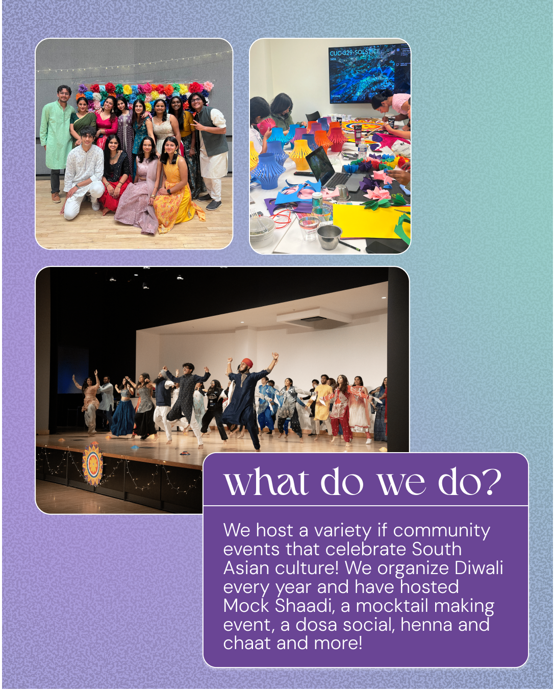
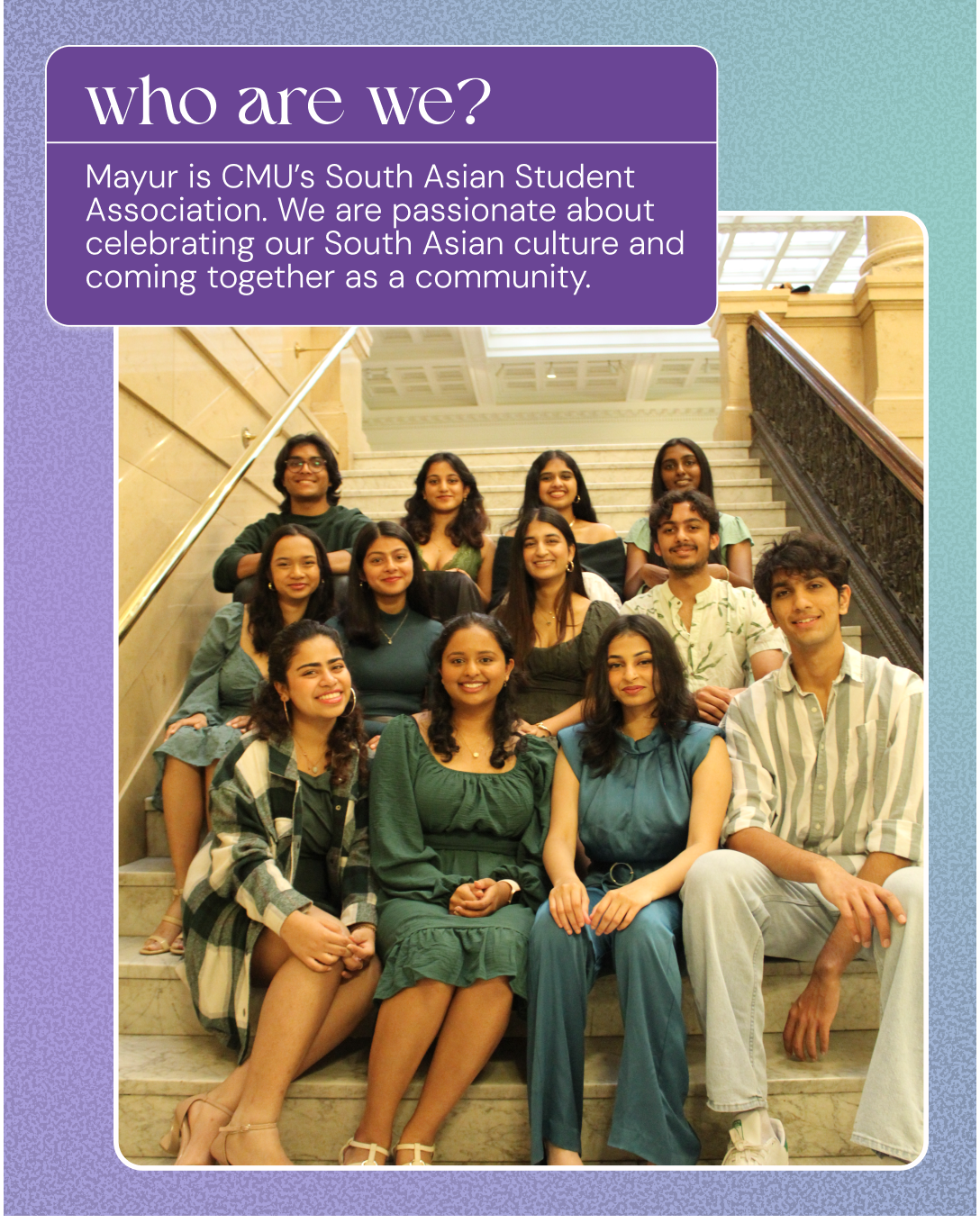
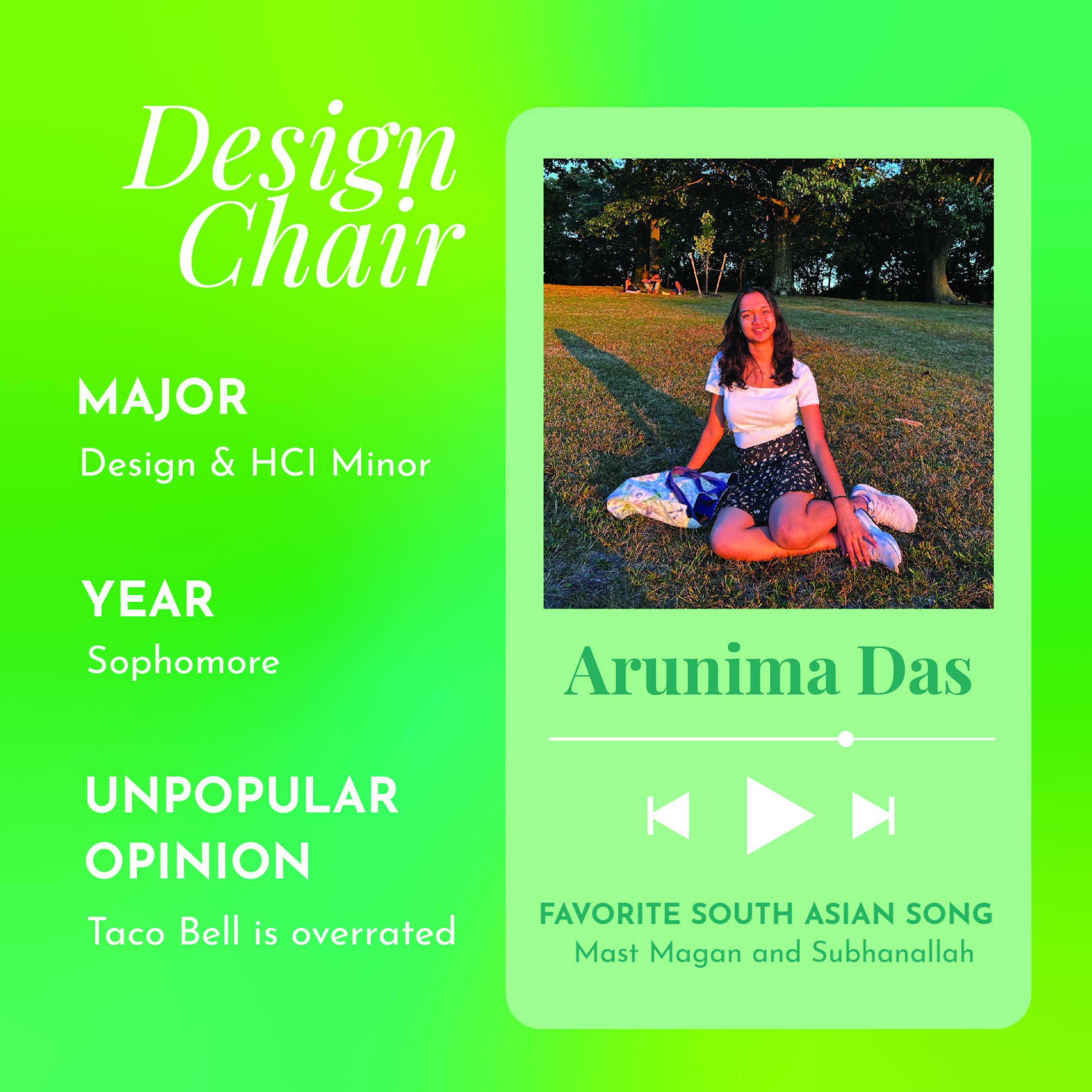
Mayur SASA is a student organization at Carnegie Mellon that aims to bring the South Asian community together through hosting events that celebrate our heritage and culture while fostering a strong and supportive community. As the Design Chair of Mayur, I design eye-catching print and digital marketing collateral such as flyers and social media assets to promote our events and encourage people to attend. I am also in charge of deciding on the visual identity for larger events and incorporating it into the decorations and design of the space.
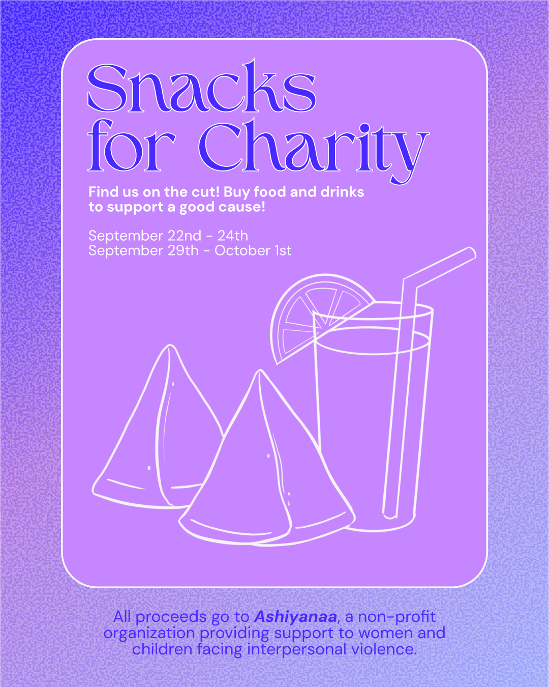
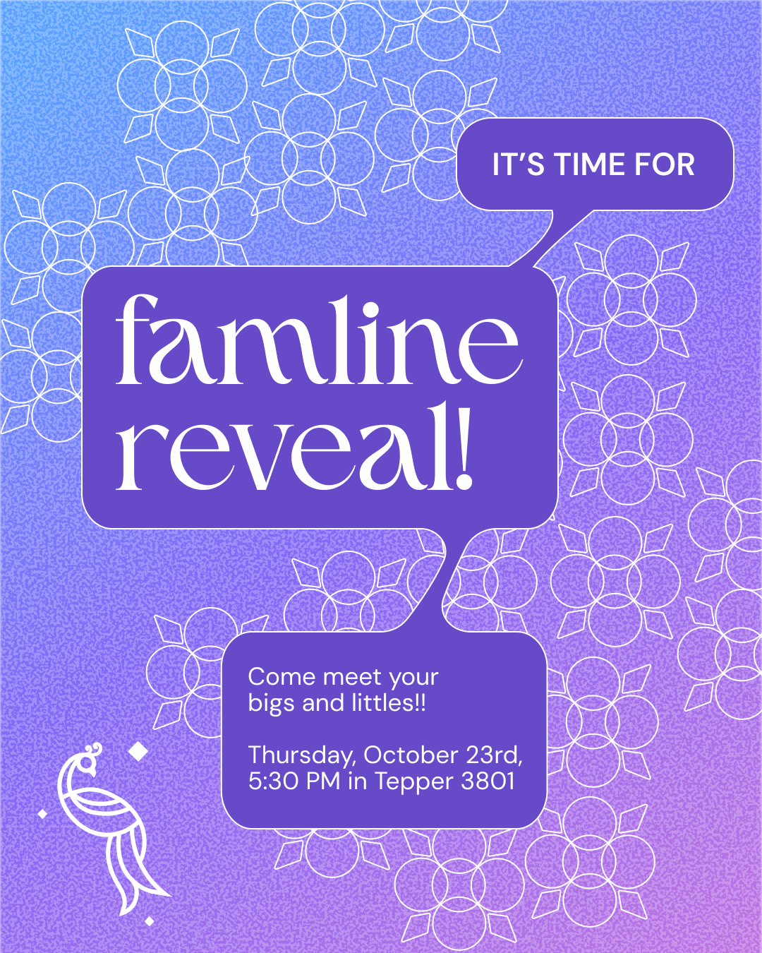
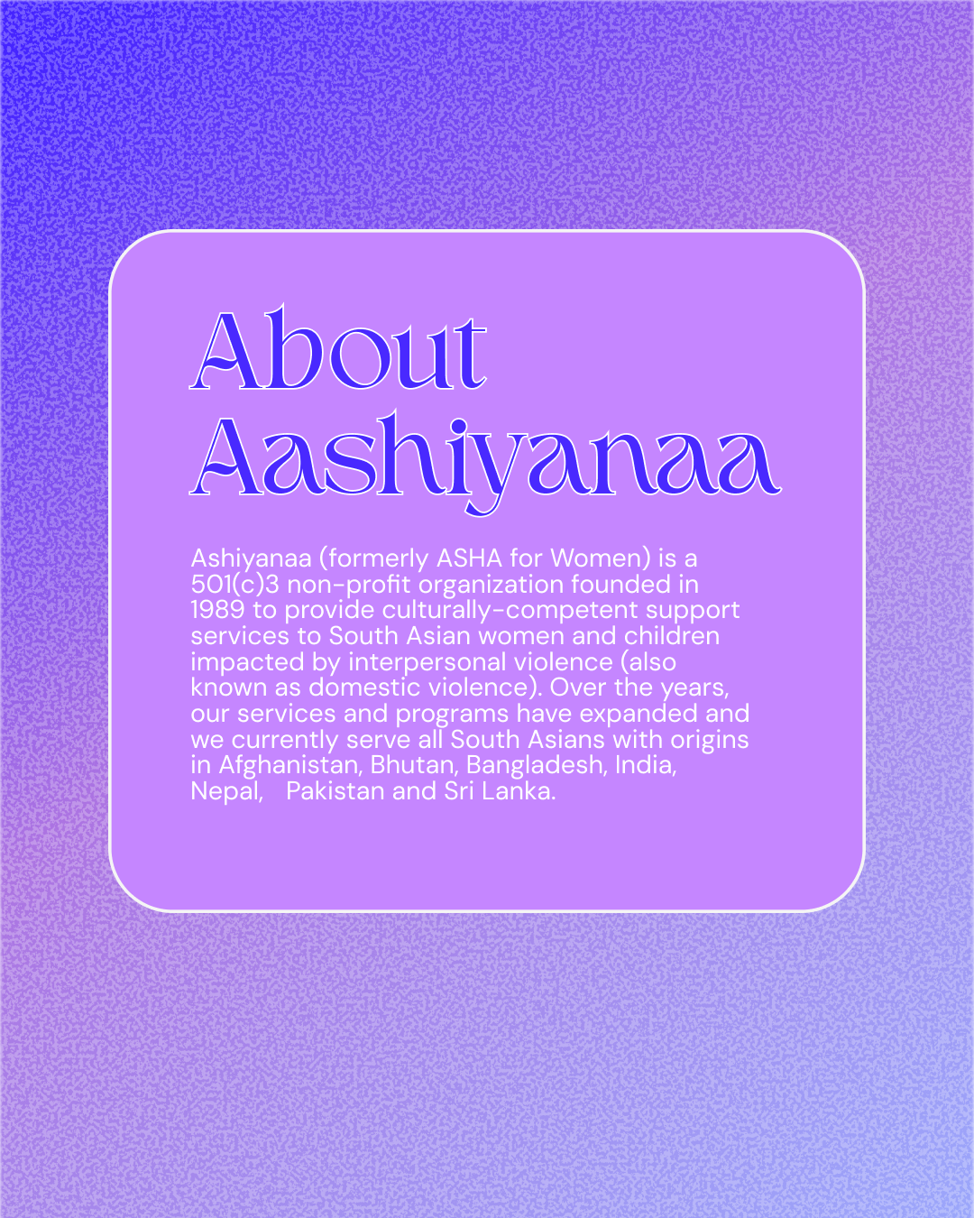
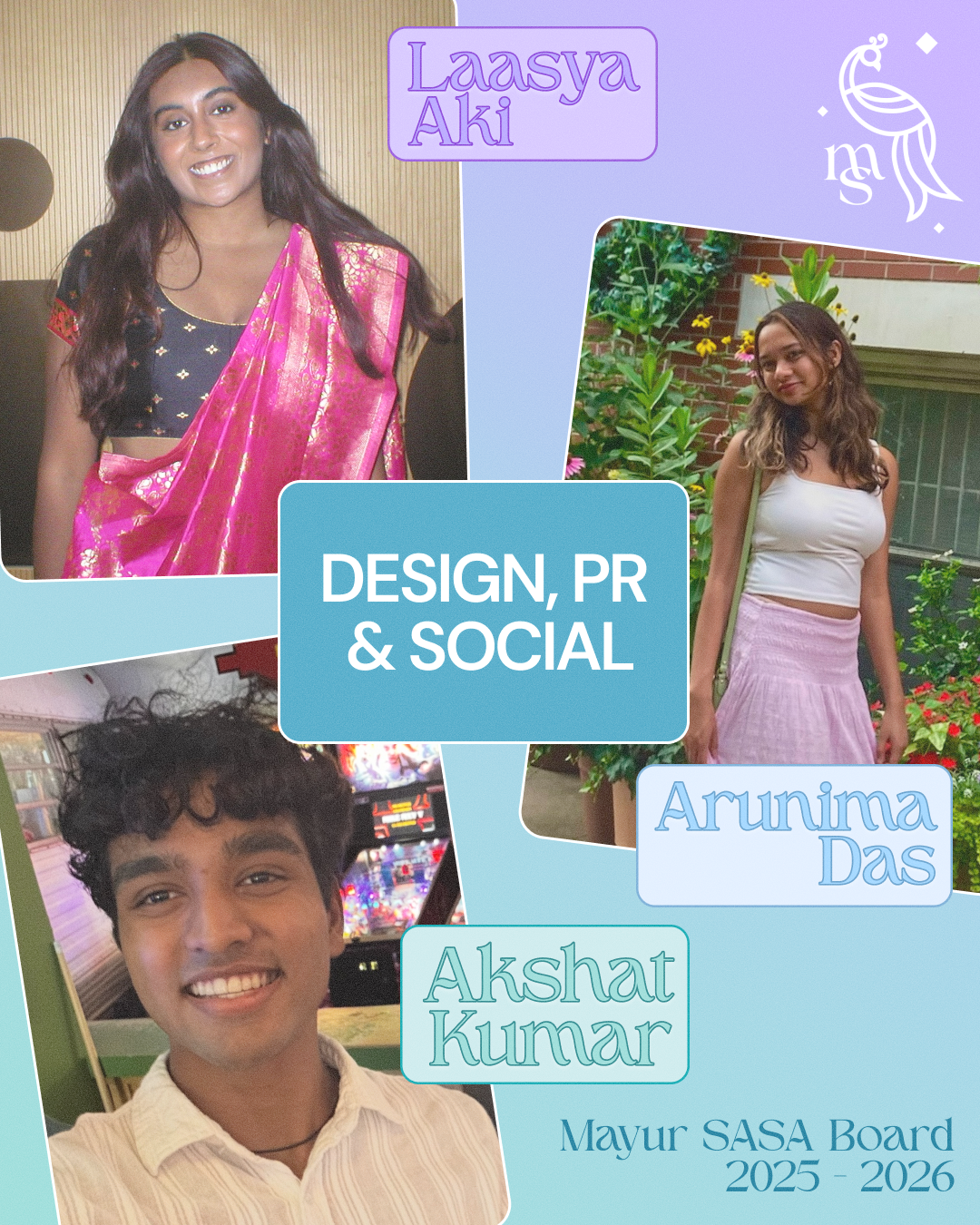
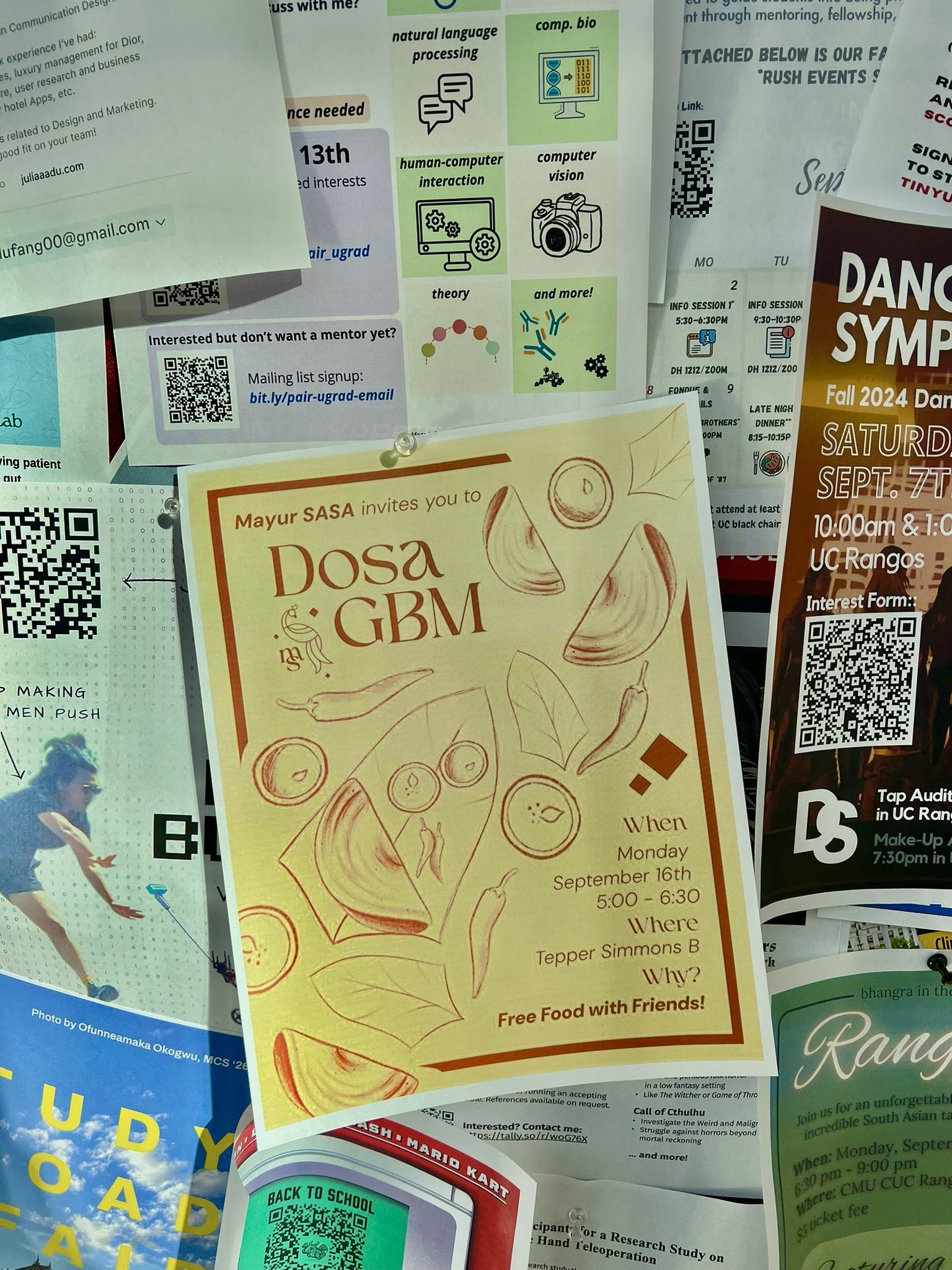
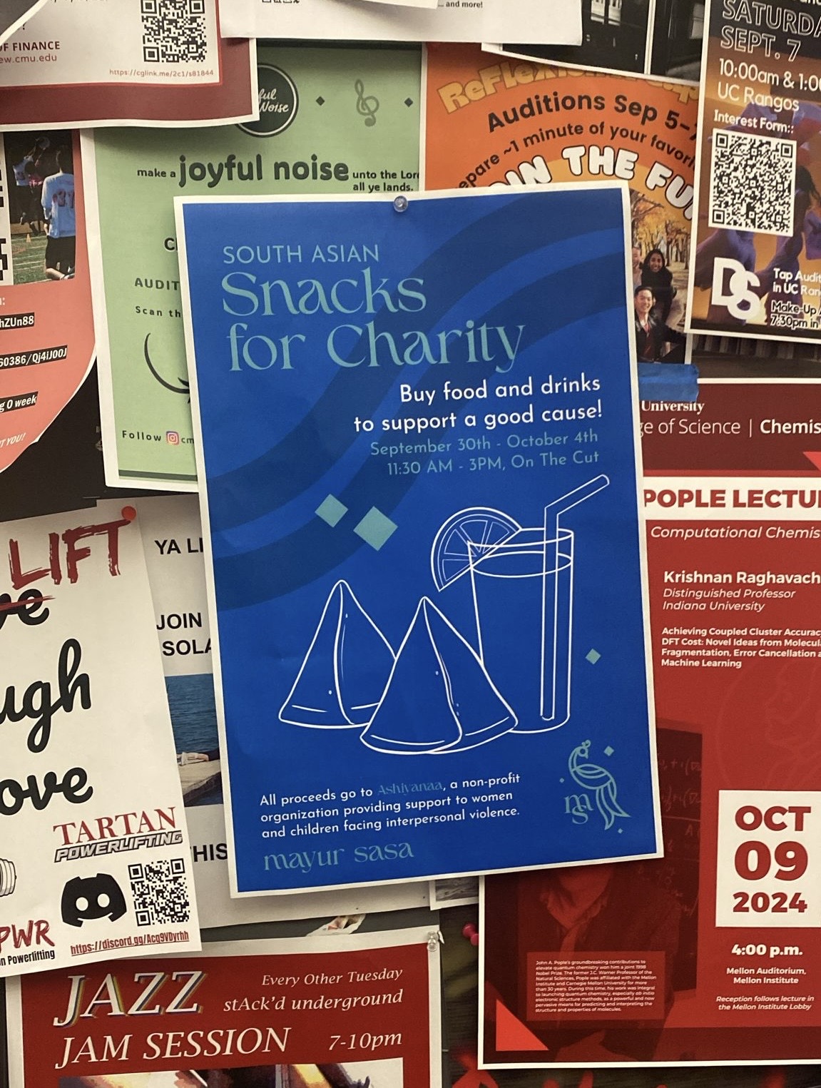
Social Media
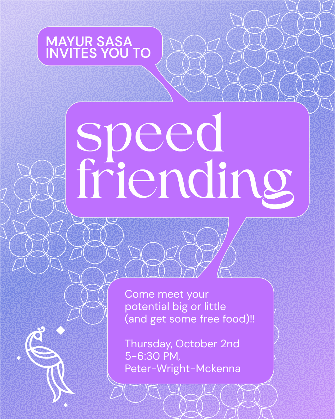
As a student organization, our main way of marketing is through our social media posts My goal was to create graphics that were eye-catching, engaging and informational and demonstrated our identity as a culture and community-oriented organization.
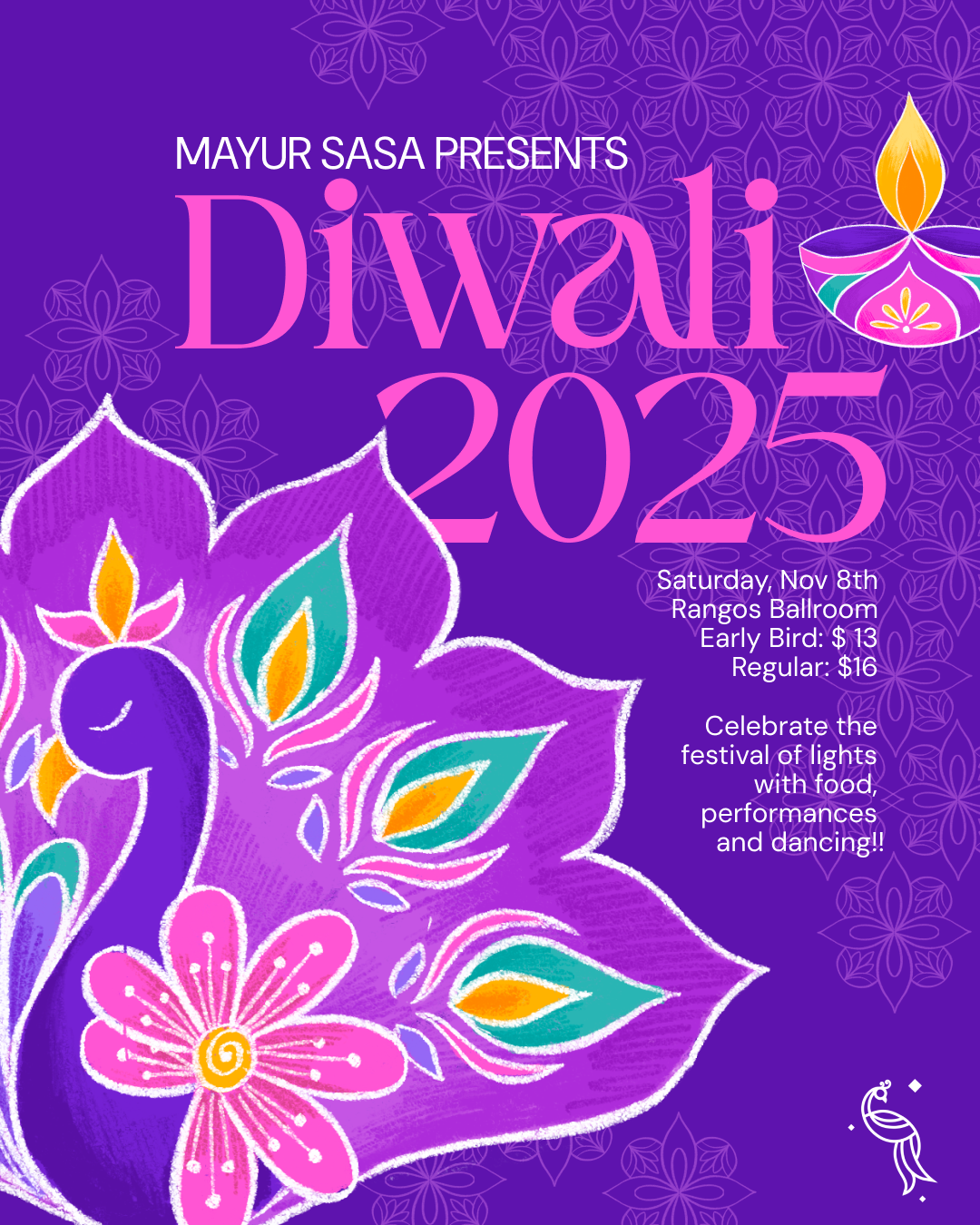
Event Branding - Diwali
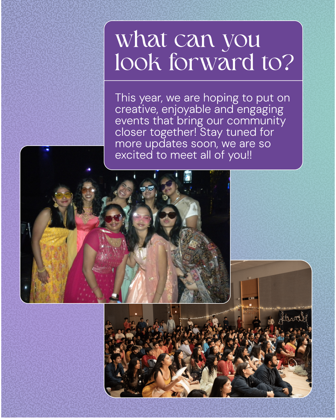
Diwali is the South Asian Festival of Lights, celebrating the triumph of good over evil. At CMU, we celebrate by gathering together, watching exciting performances, eating delicious food and dancing the night away. As one of my favorite holidays, I was excited to be in charge of the visual identity and representing this festival through my designs.
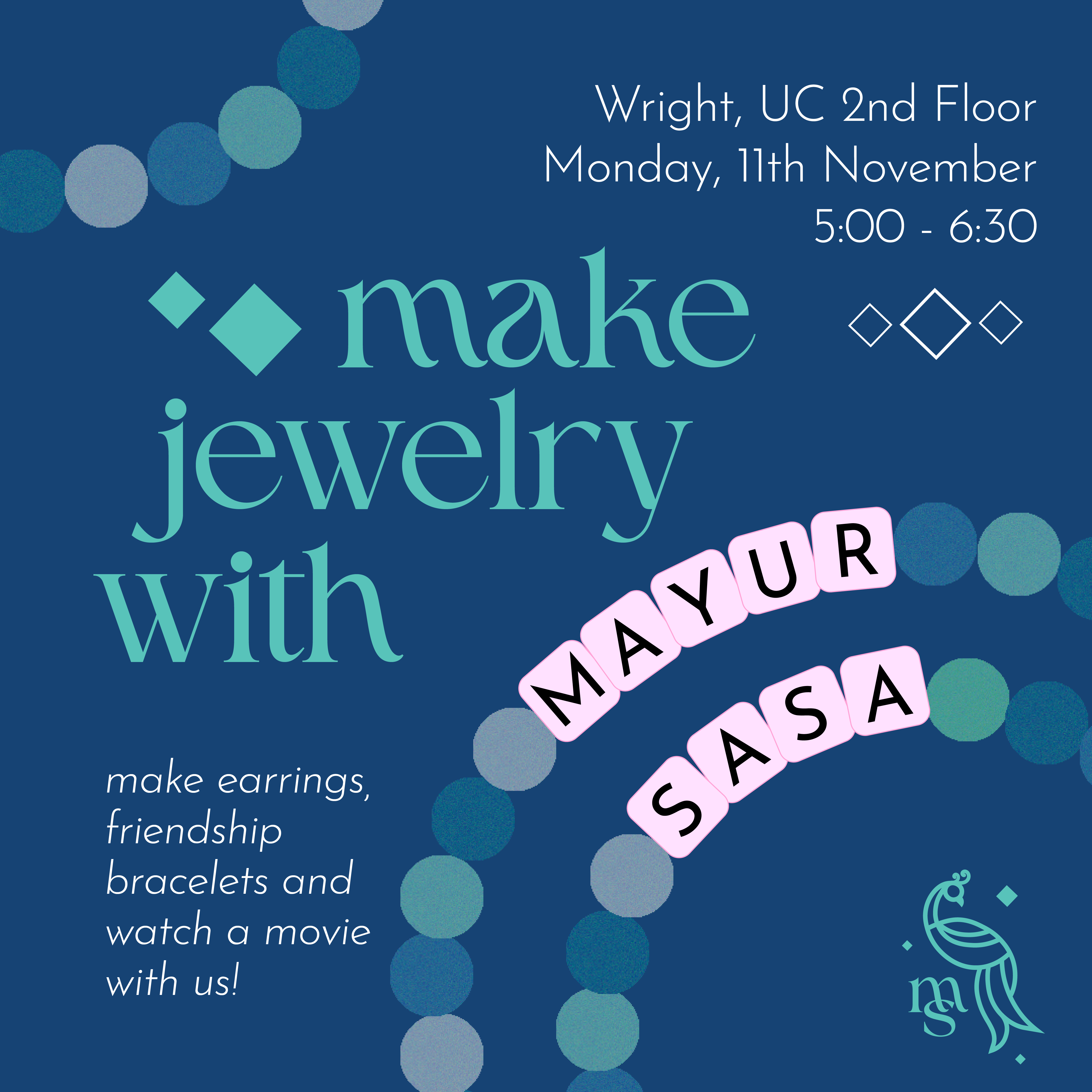
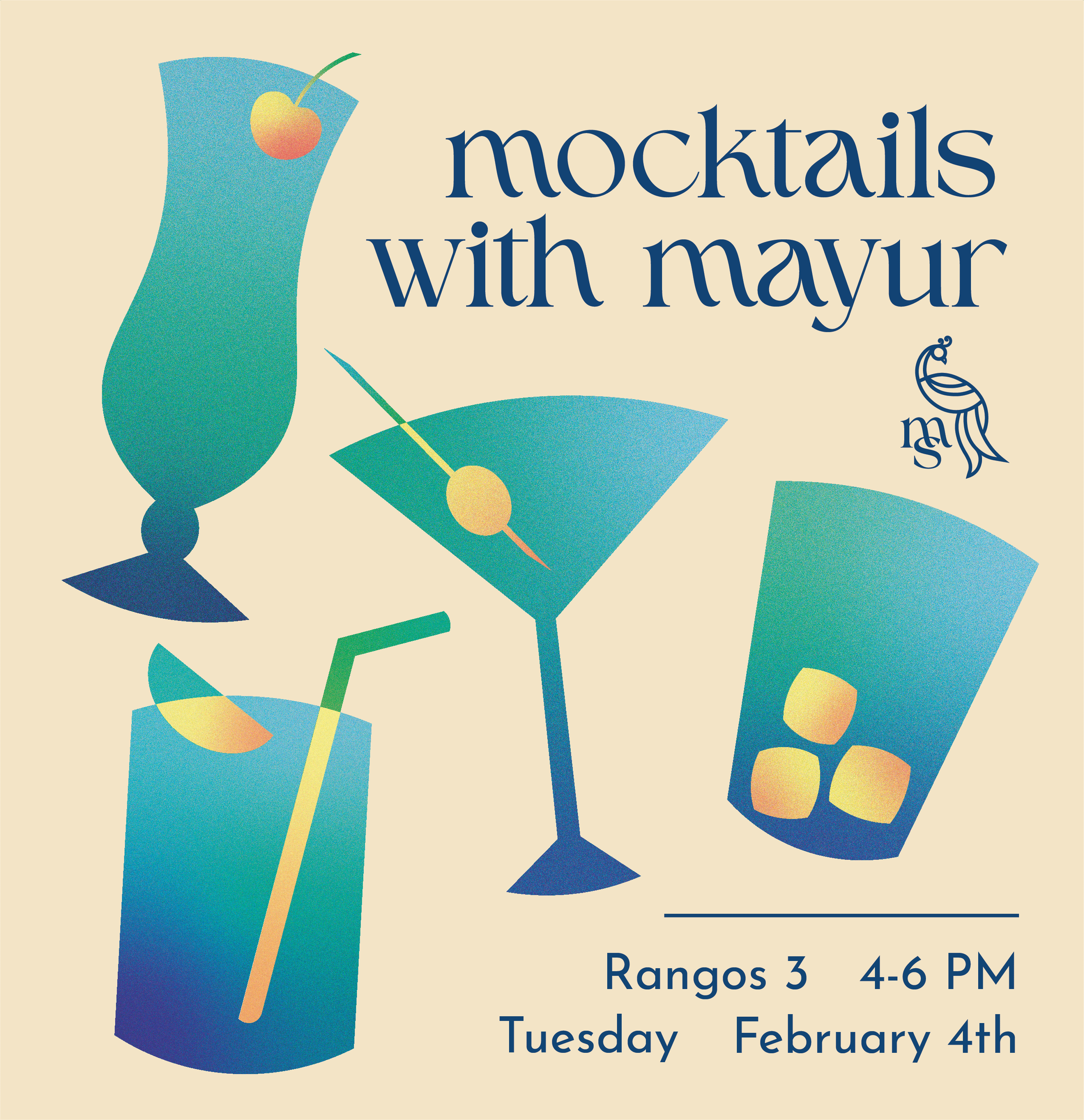
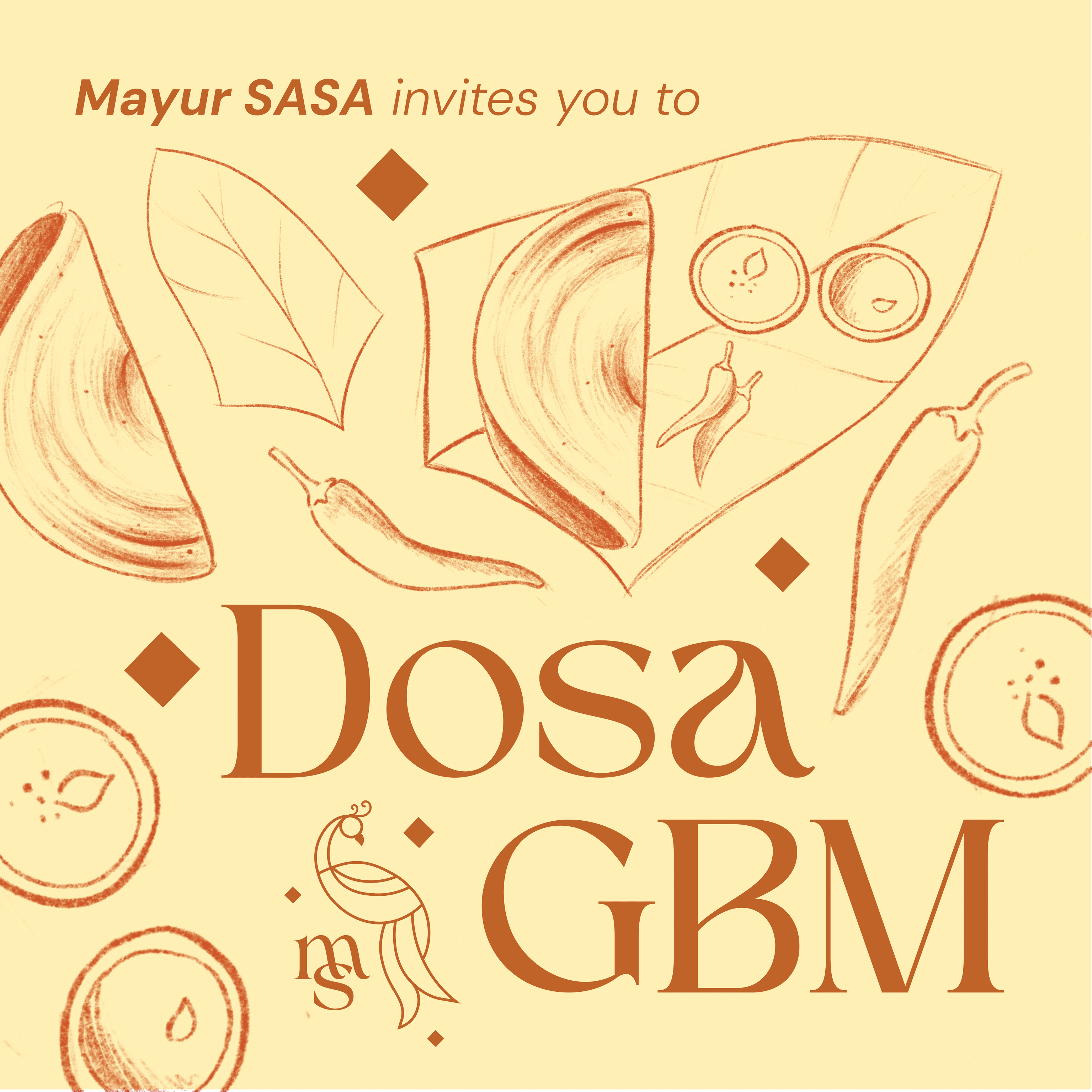
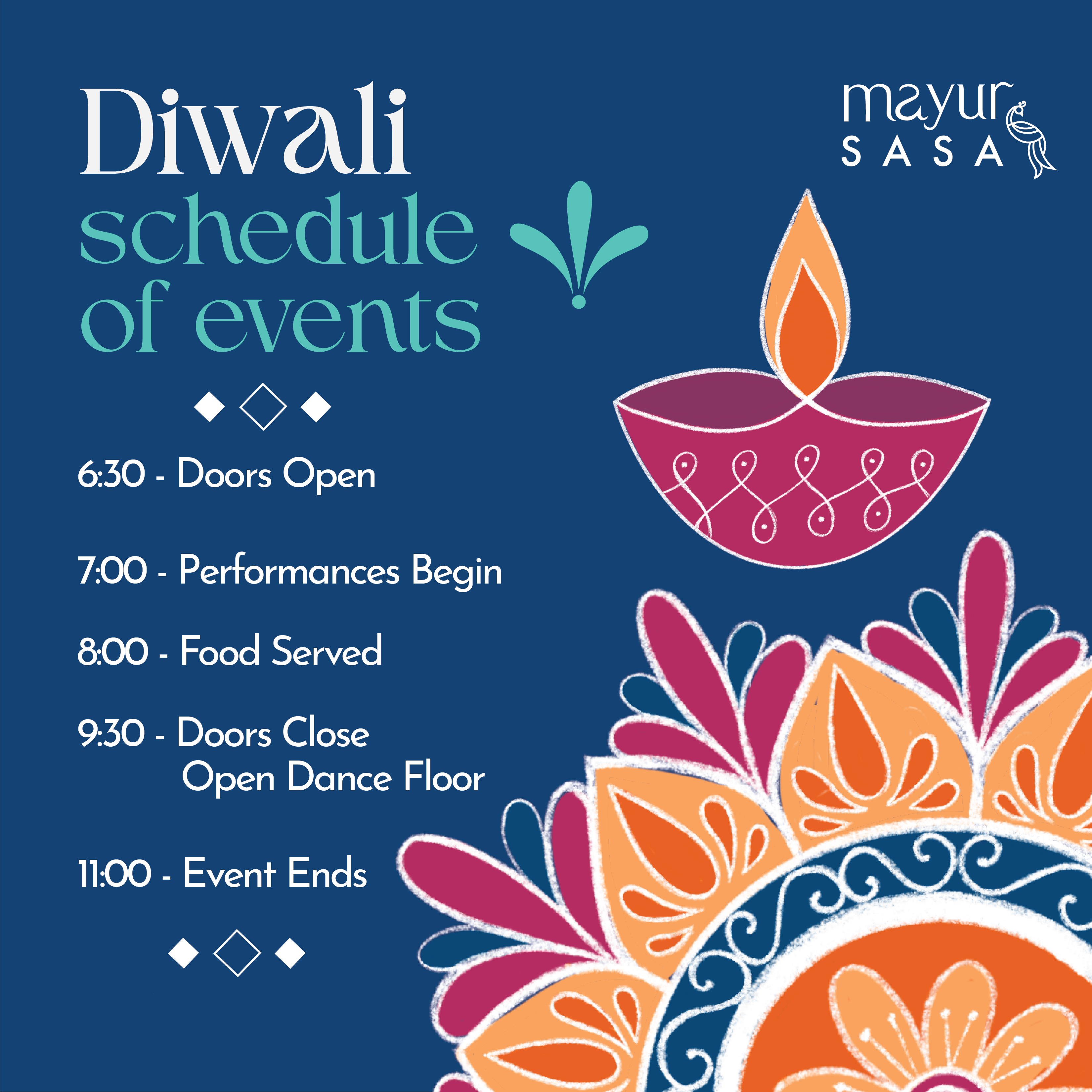
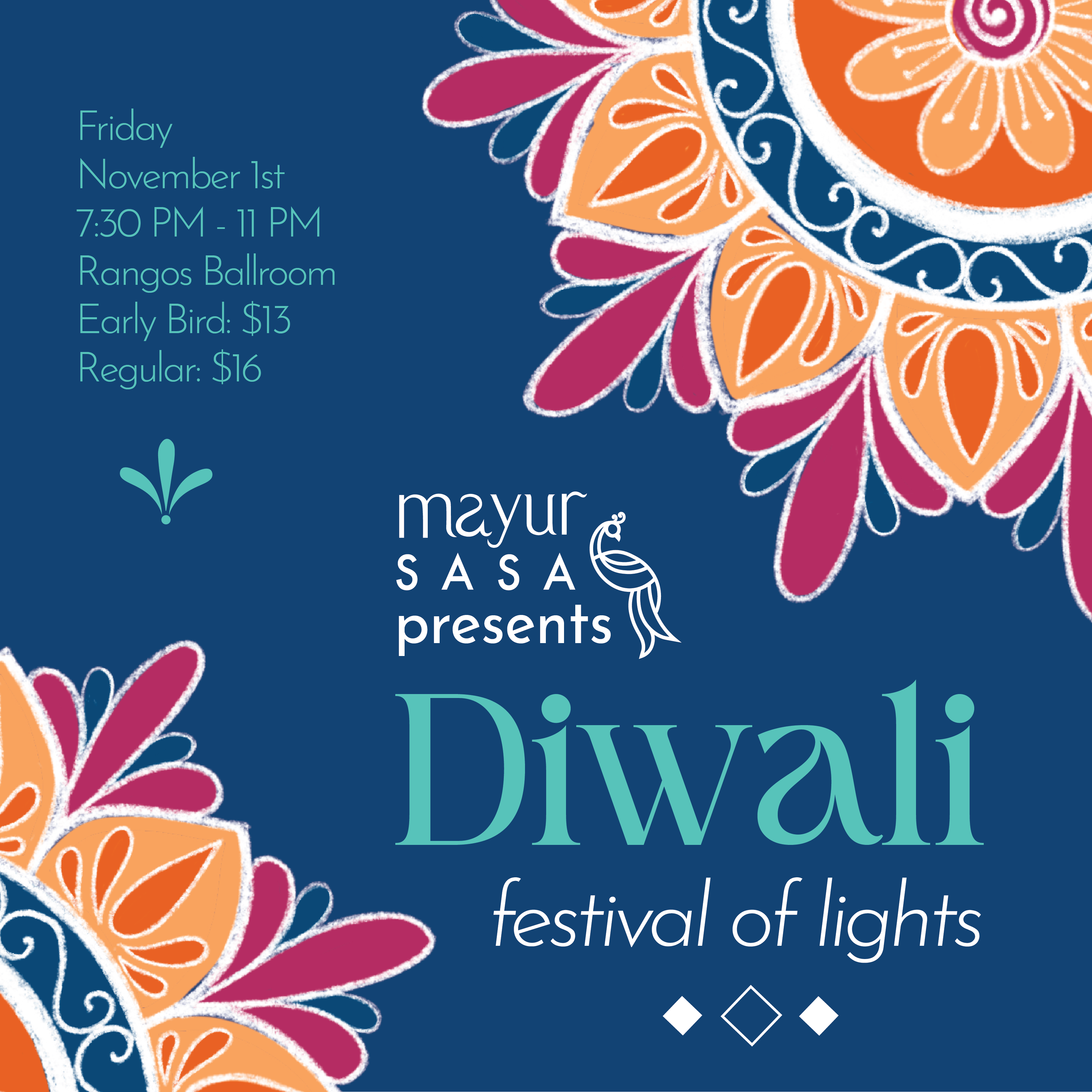
Social Media
As a student organization, our main way of marketing is through our social media posts My goal was to create graphics that were eye-catching, engaging and informational and demonstrated our identity as a culture and community-oriented organization.


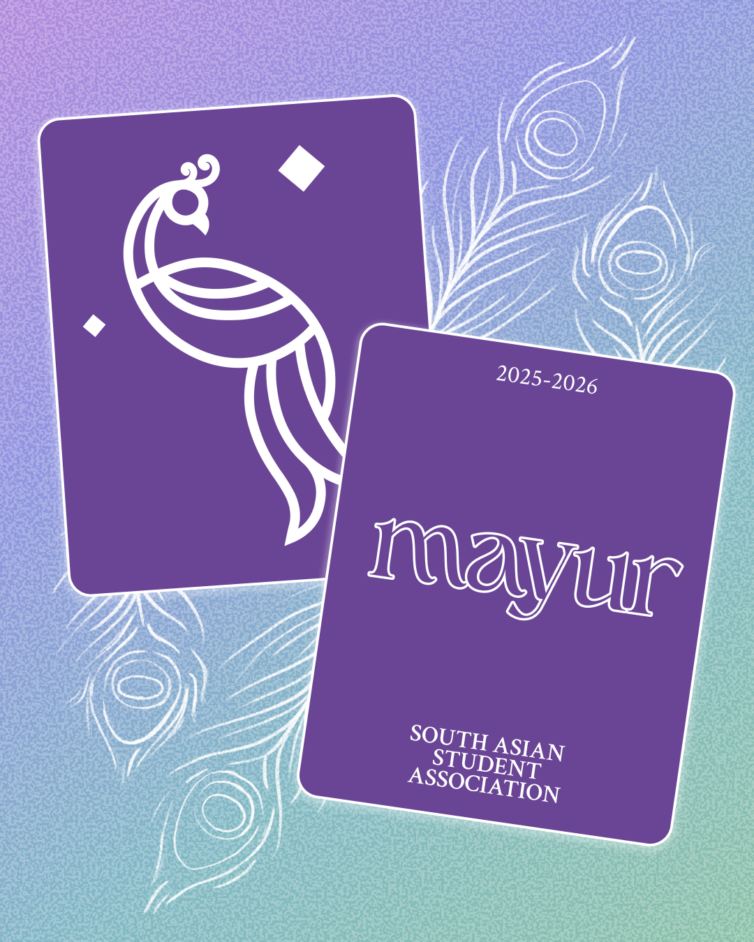
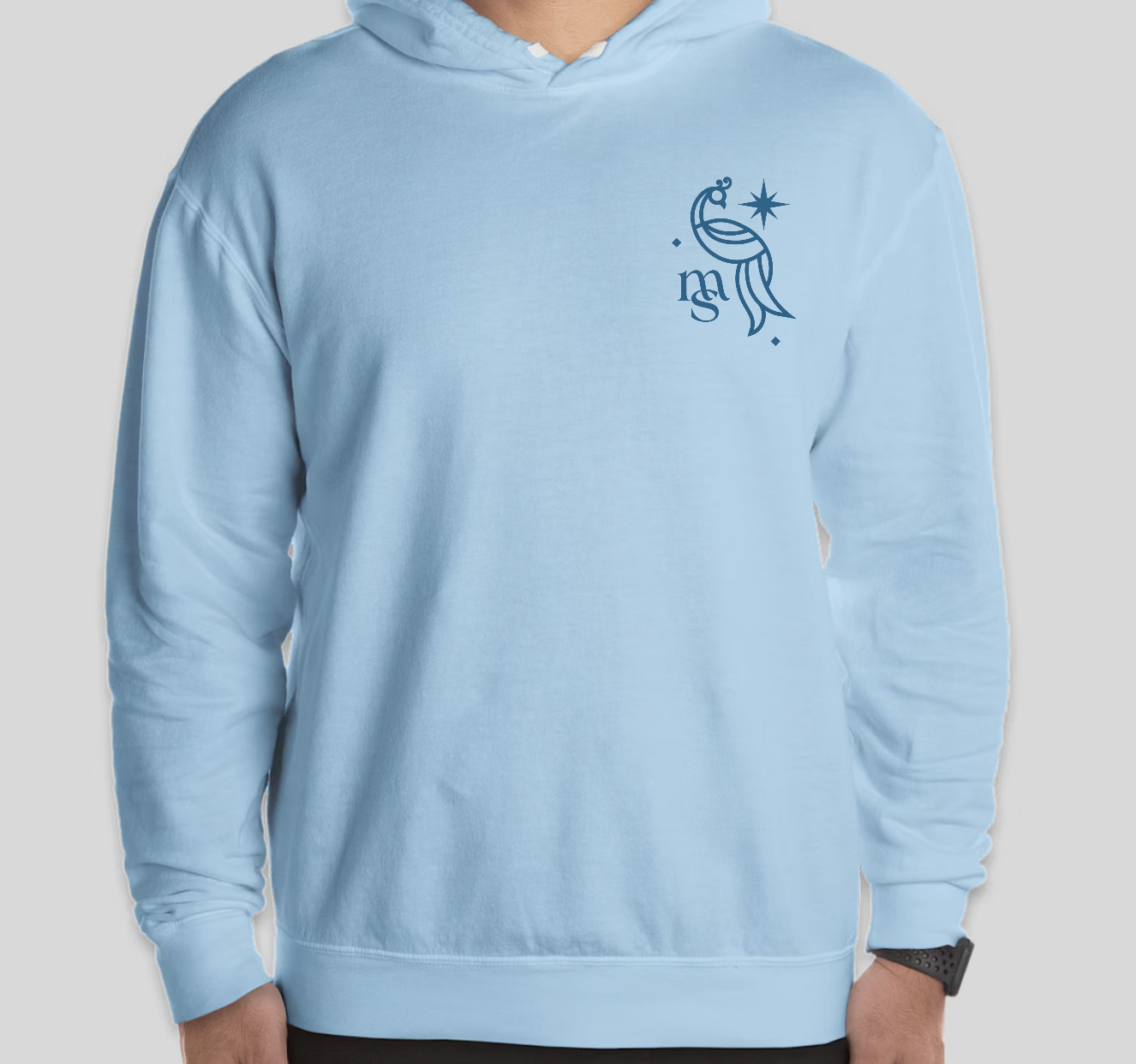
Merchandise
Tasked with designing merchandise for the leadership team, I wanted to create something unique that represents Mayur visually, yet subtle to be worn every day. For the front of the sweatshirt, I went with the Mayur logo (designed by the talented Shruthi Prasanth), and added a sparkle next to the peacock for a fun touch. For the back, I created a unique shape, inspired by a form often found in South Asian fabrics and architecture. I placed the Mayur wordmark and some basic information within the shape. Around it, I included the sparkle from the front, as well as some diamonds that are found in the logo.

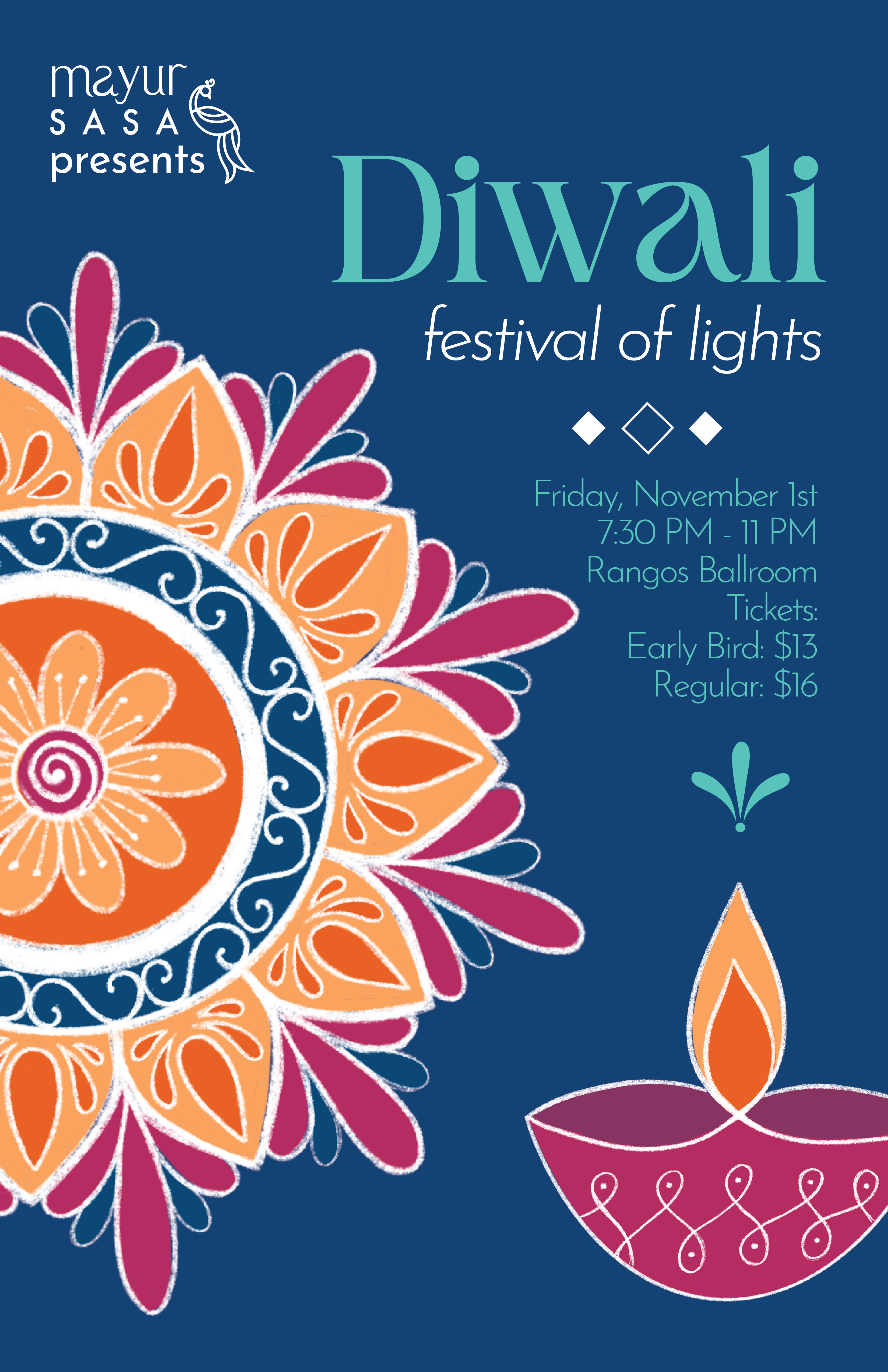
Event Branding - Diwali
Diwali is the South Asian Festival of Lights, celebrating the triumph of good over evil. At CMU, we celebrate by gathering together, watching exciting performances, eating delicious food and dancing the night away. As one of my favorite holidays, I was excited to be in charge of the visual identity and representing this festival through my designs.
COLOR PALETTE
I wanted to incorporate a few more colors in addition to the Mayur brand colors, in order to bring in the warmth of home. To contrast our blue and teal brand colors, I chose a bright orange and an orange-yellow to bring a sense of warmth and comfort. These colors are reminiscent of marigolds often used to decorate homes during the festival as well as the flame of an oil lamp. Additionally, I incorporated a bright purple and pink to create a sense of vibrance and joy.
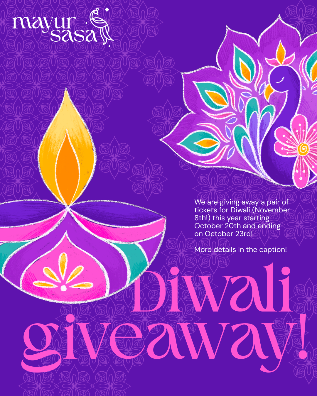
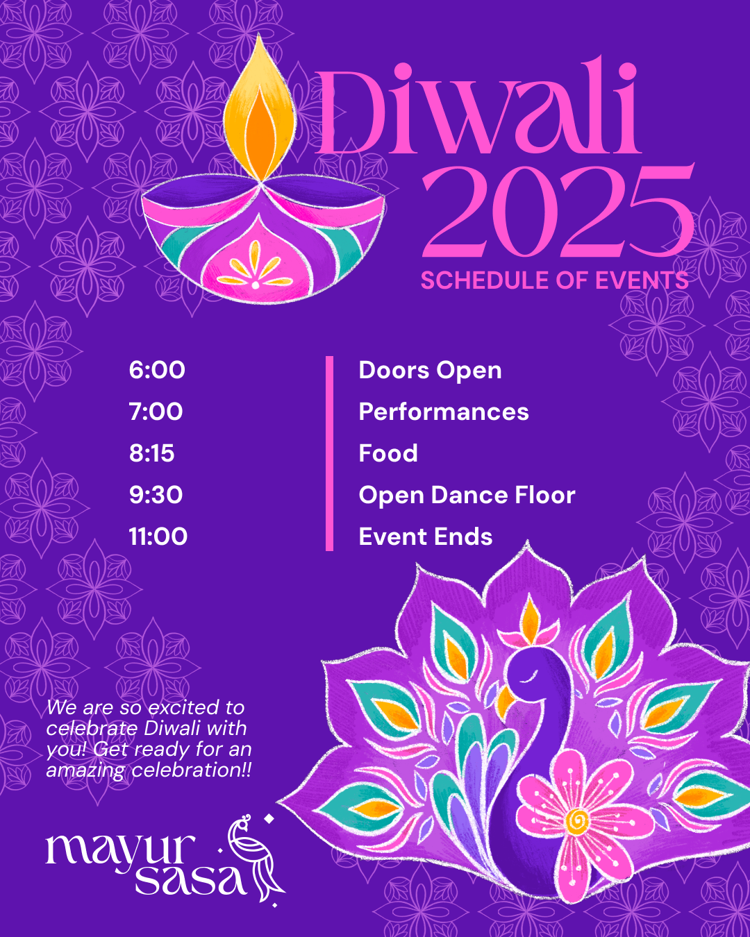
ASSETS
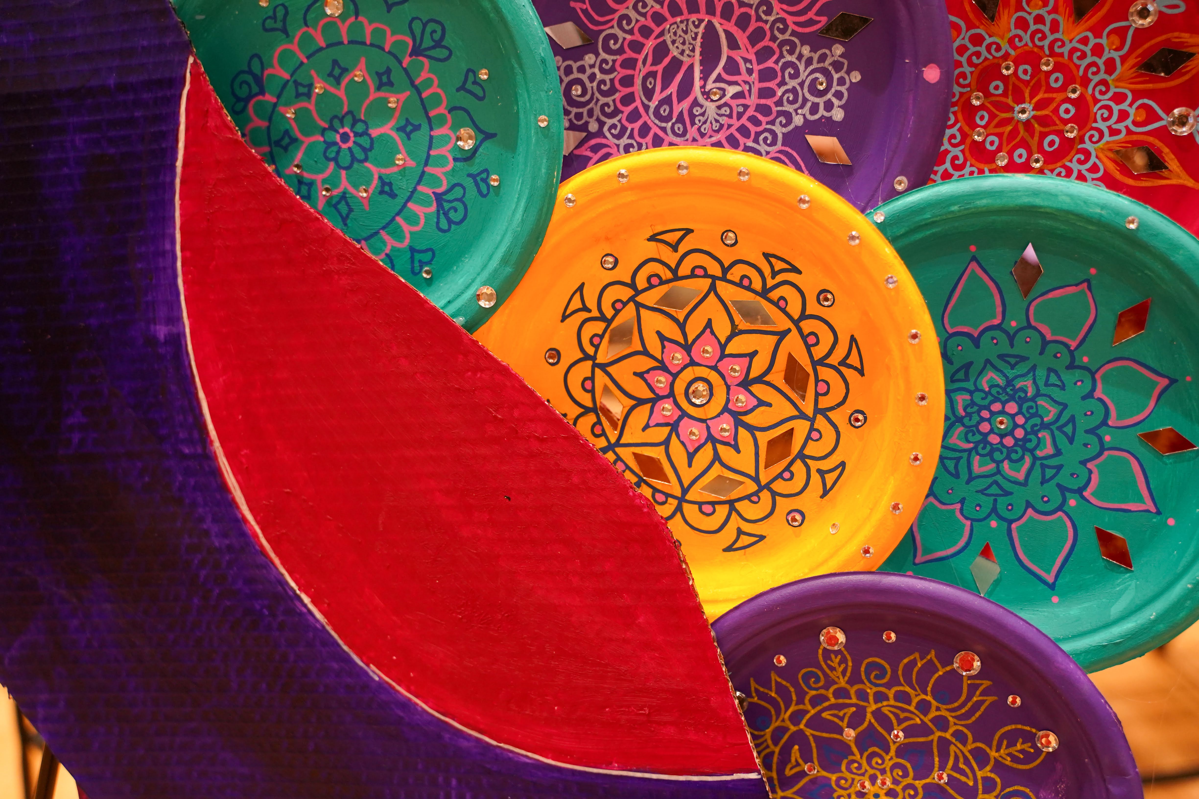
I illustrated a diya (oil lamp) and rangoli (design made with colored powder) as assets to be used across various deliverables. I wanted there to be an aspect of the branding that was rooted in culture and familiar to the people who celebrate Diwali at home while also being bright, interesting and eye-catching to a general audience. Having a hand-drawn aspect to the branding, creates a sense of human-ness and connection, which I wanted to emphasize for this beloved festival.
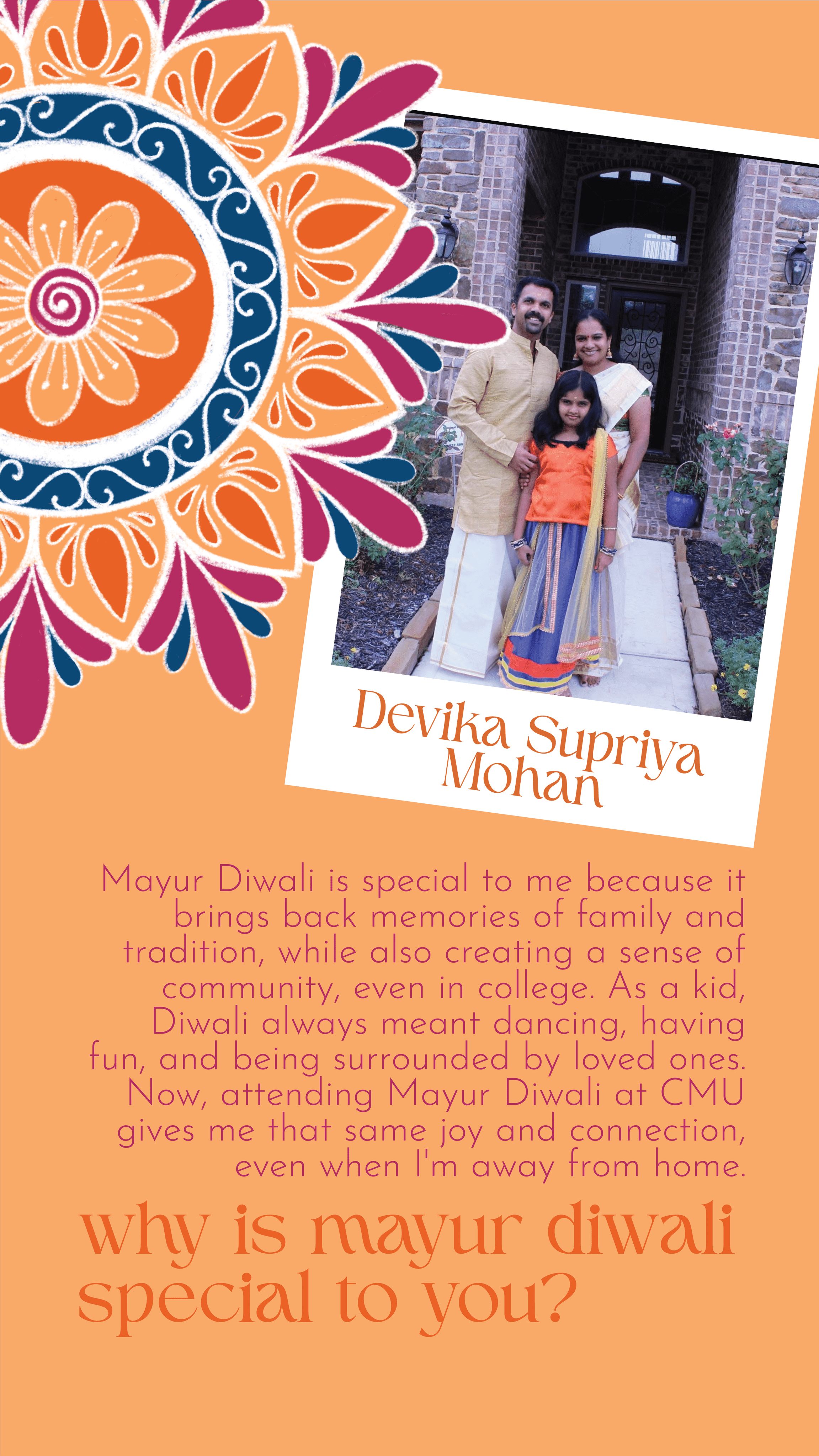
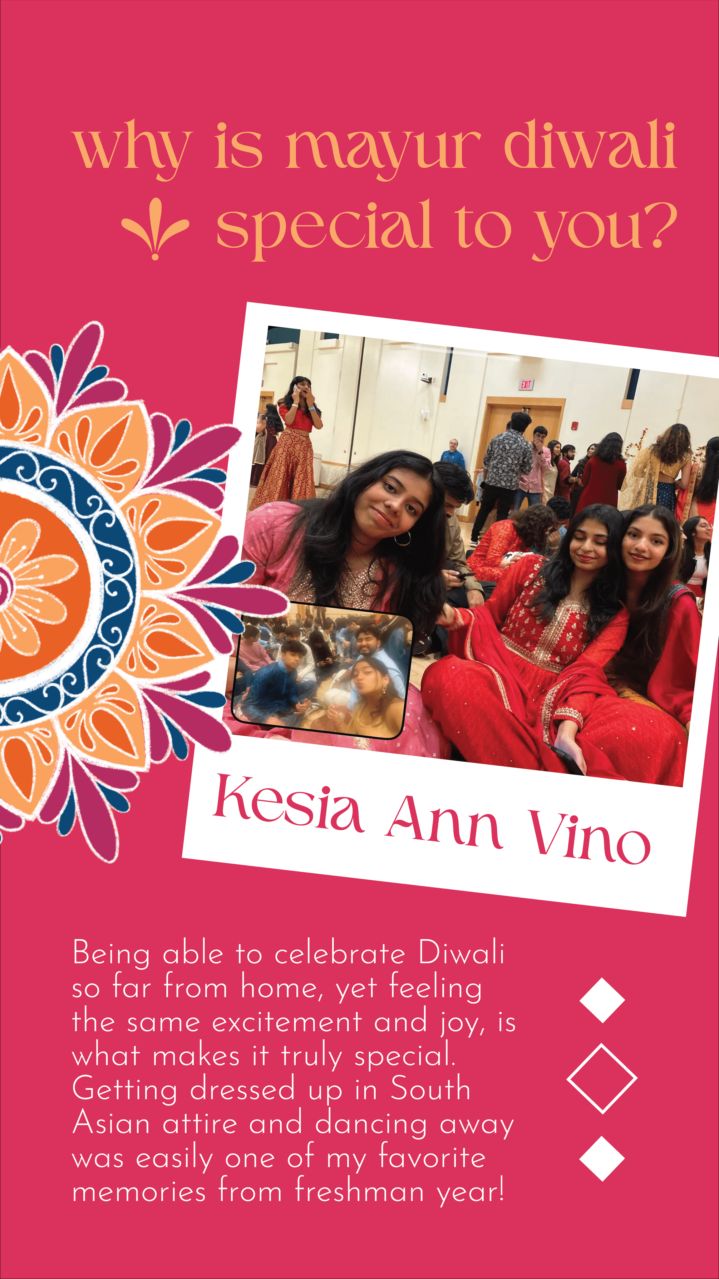
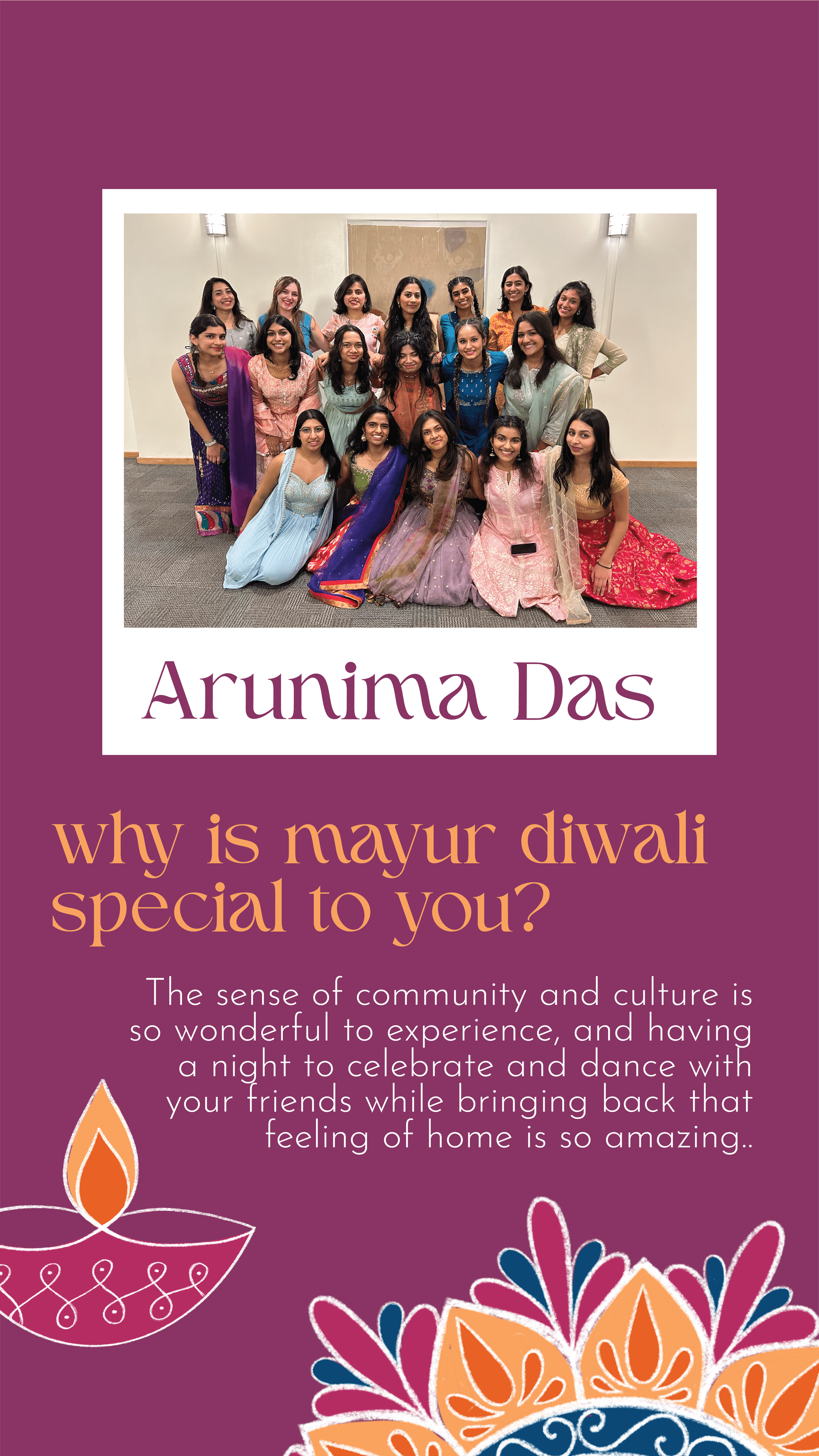
ENGAGEMENT
In order to gain engagement and begin to build excitement for the event, we asked the Mayur board "Why is Mayor Diwali special to you?" Based on their answers, I designed Instagram stories, using the established colors and assets, that shared members fond memories in order to encourage attendance!
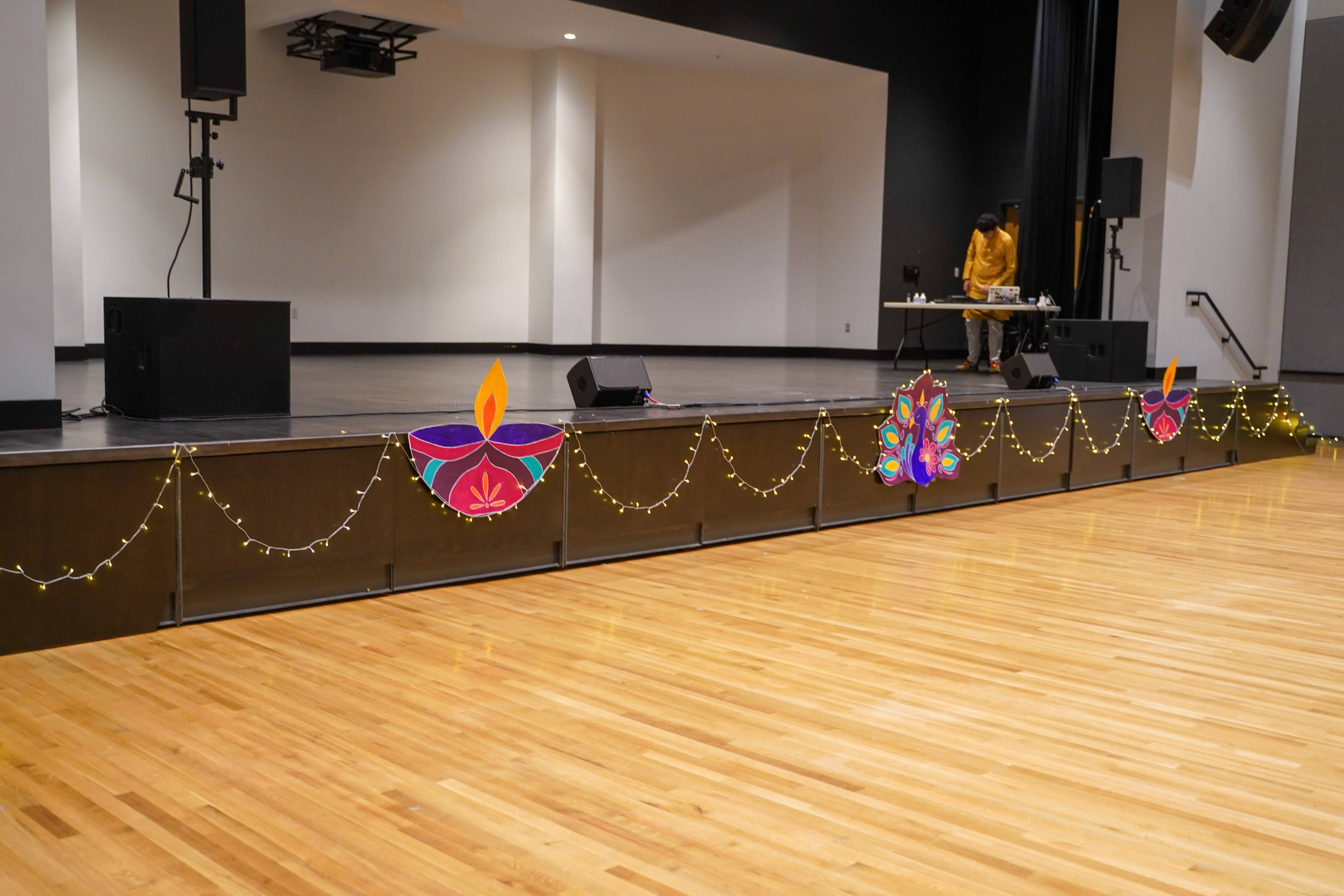
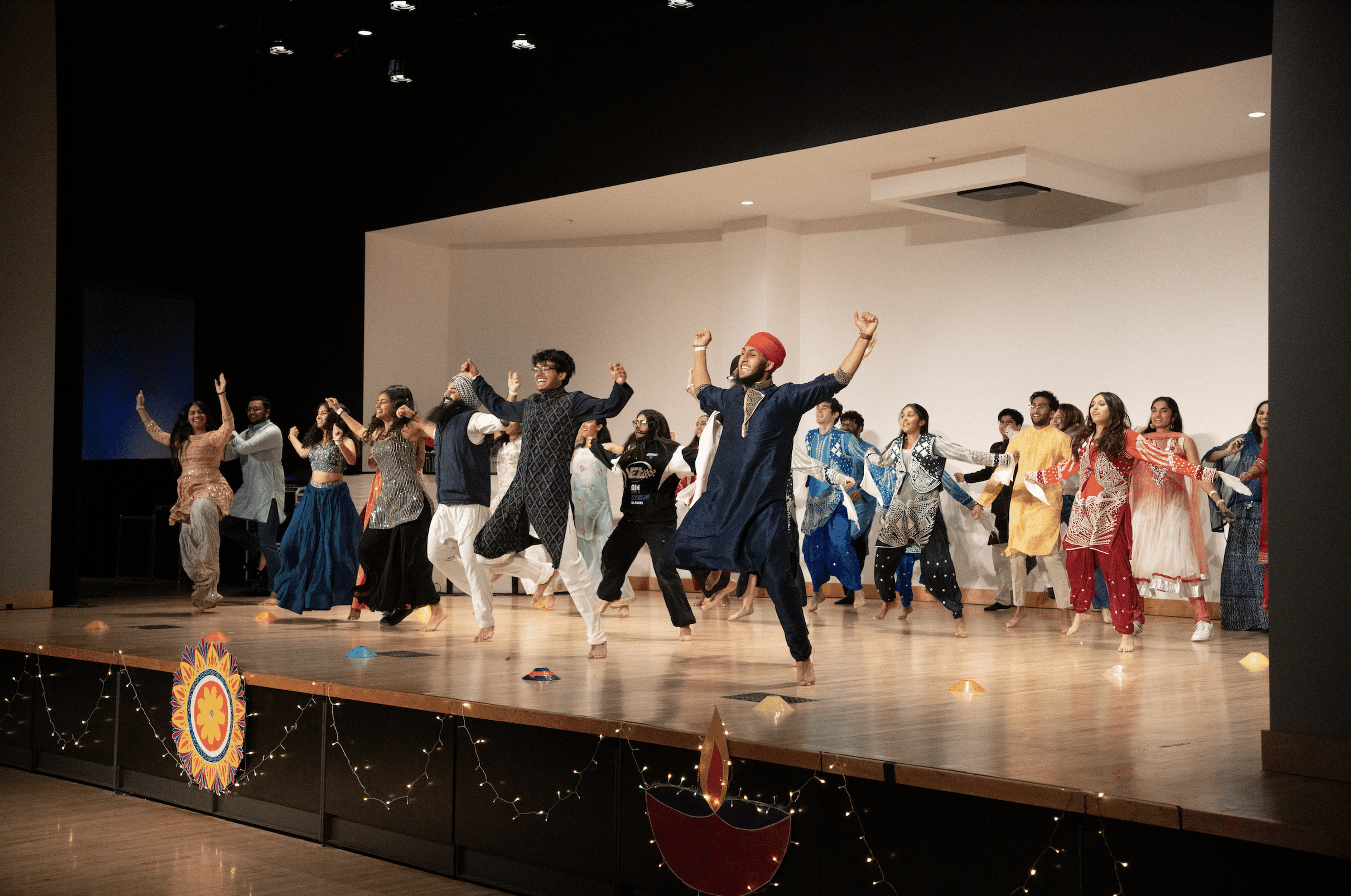
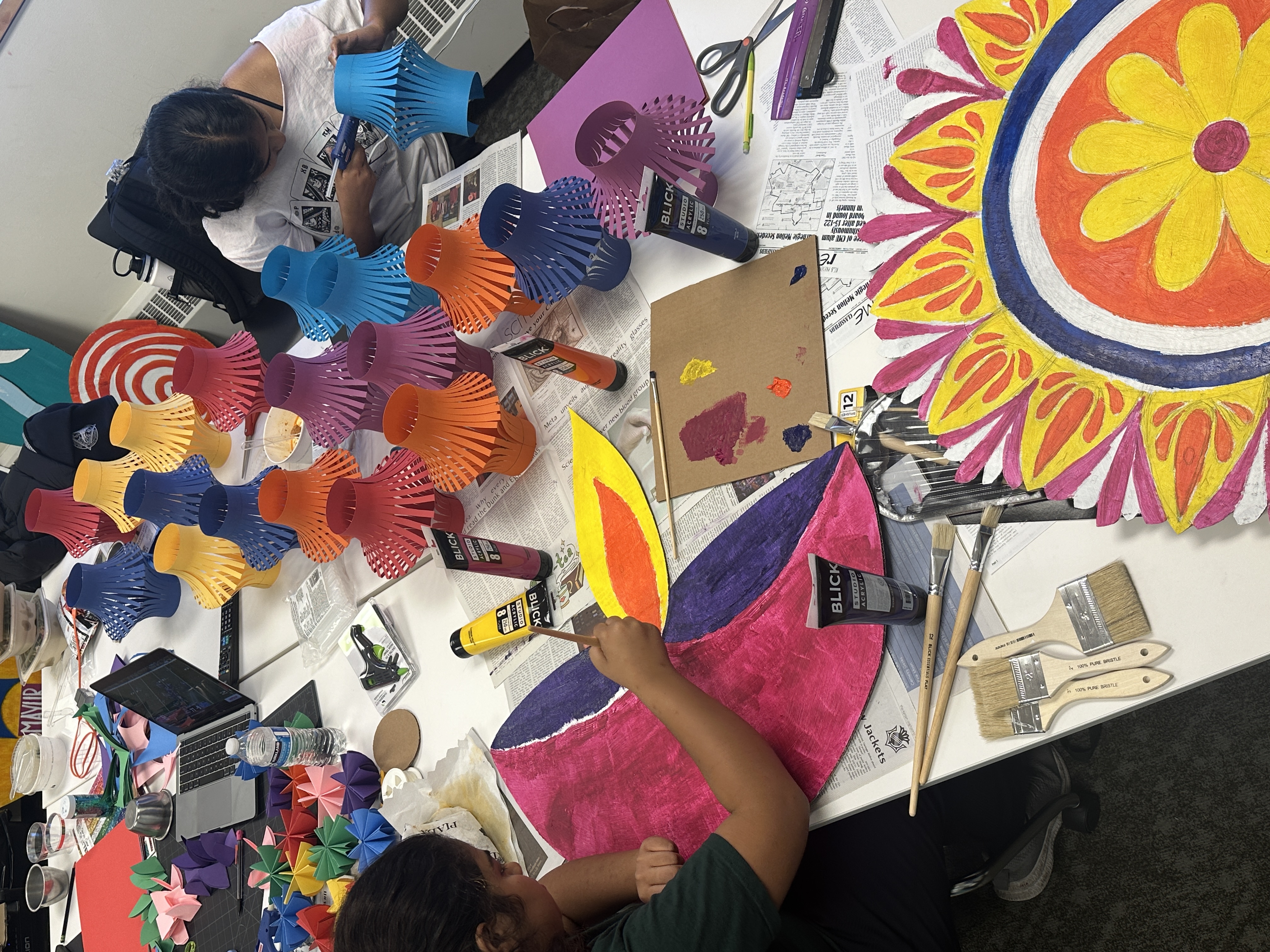
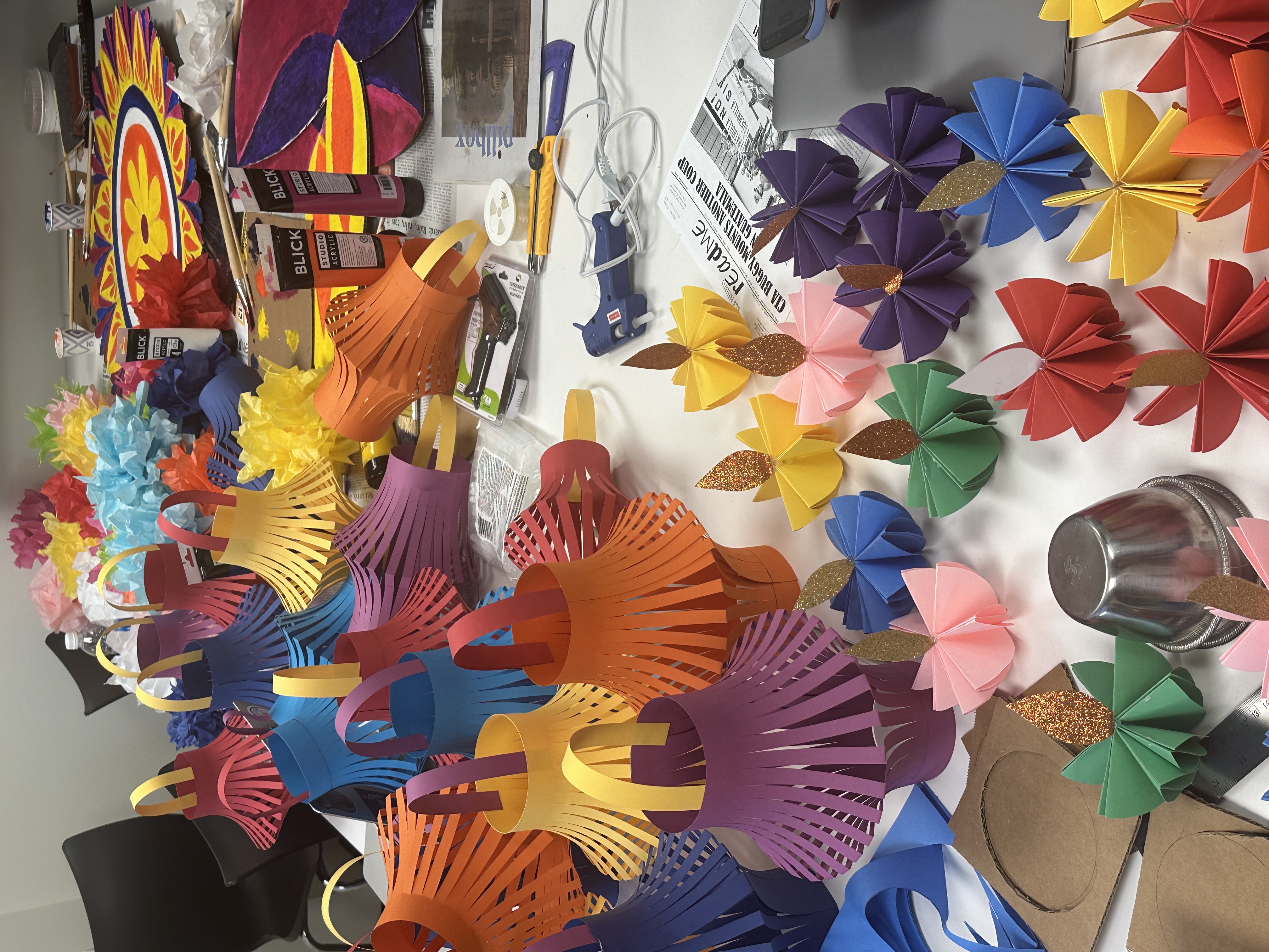
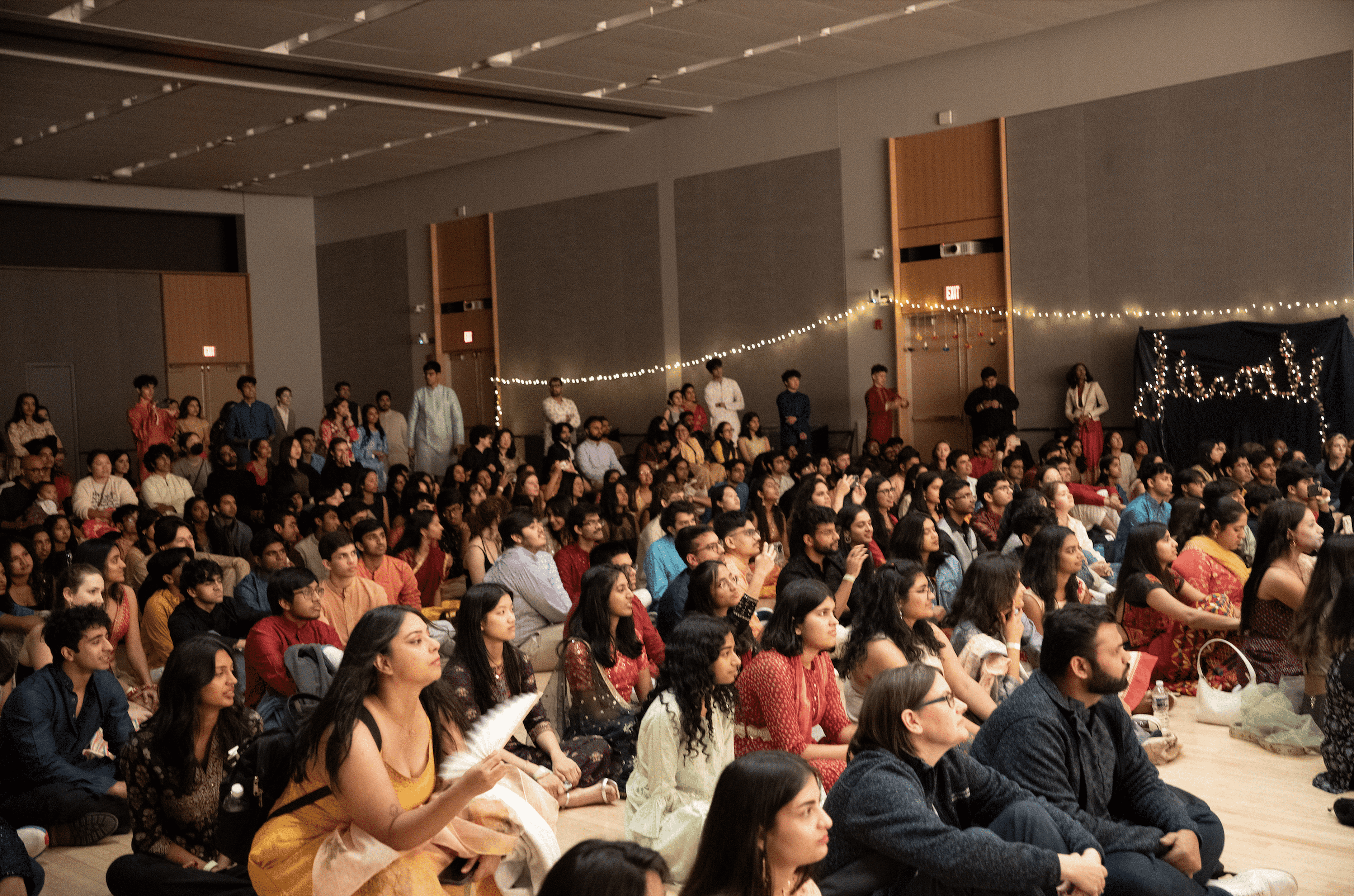
Event Design
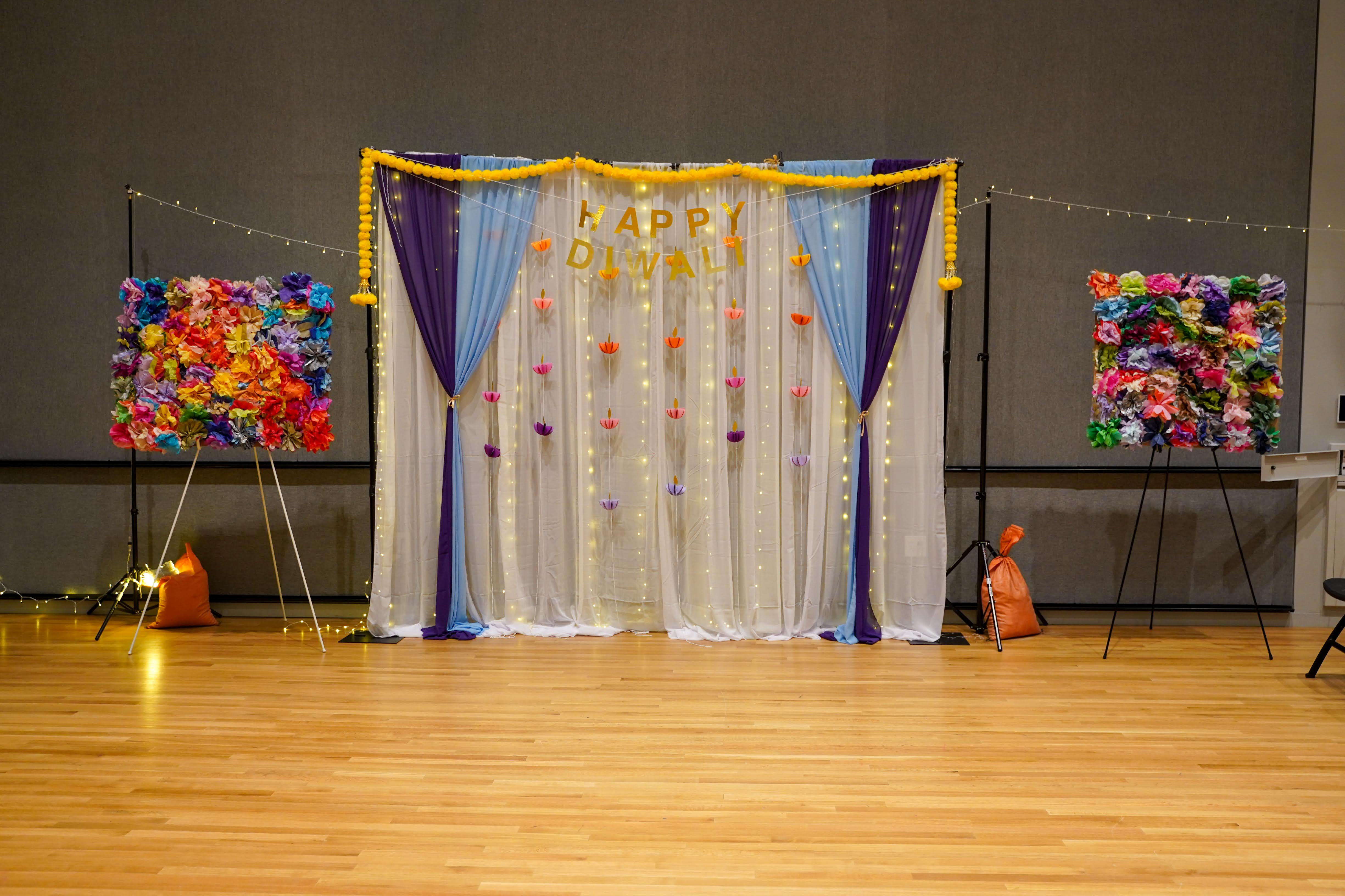
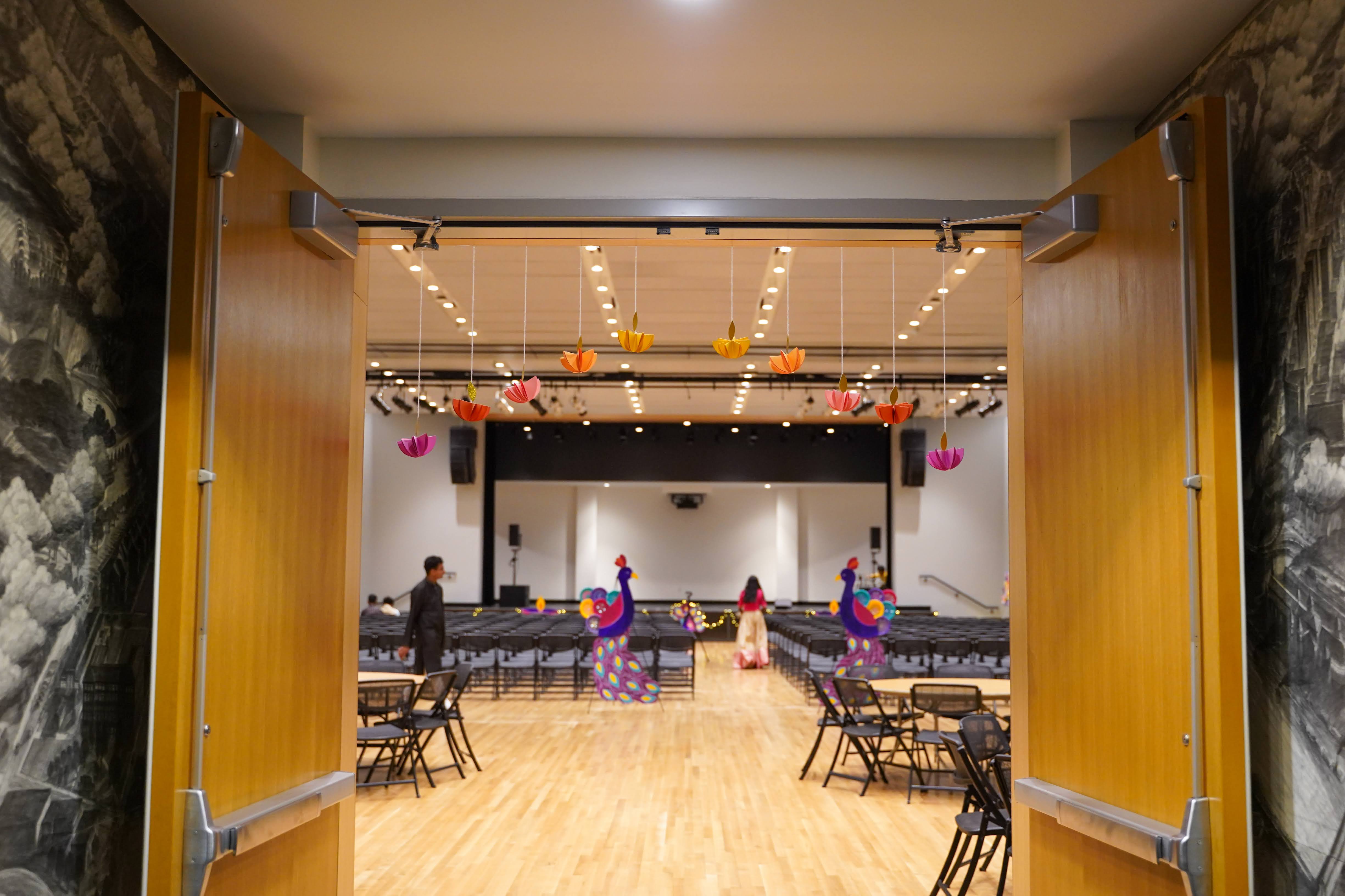
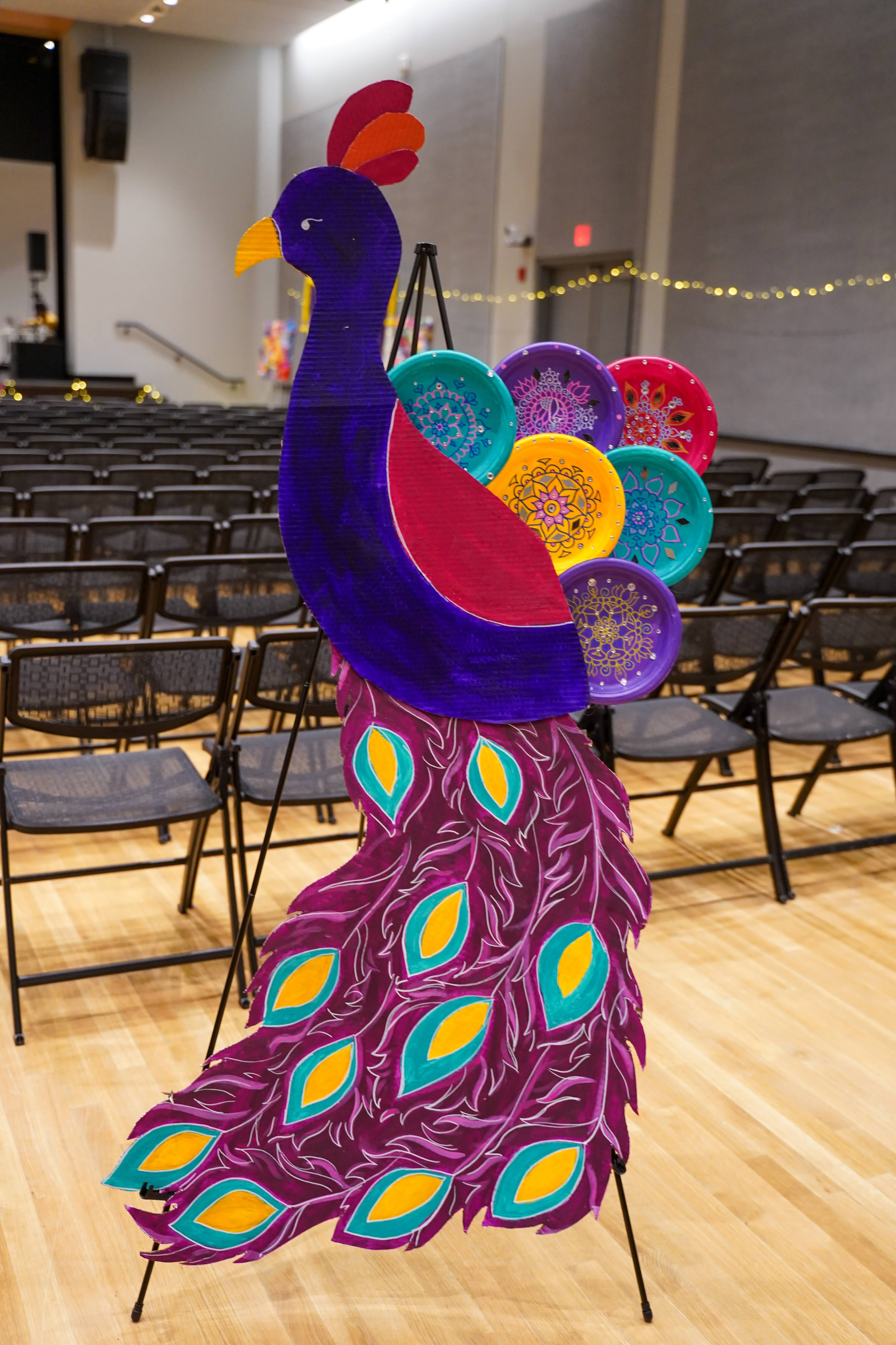
How do we make large,community space have the same warmth and comfort as home? My goal with the decorations and the spatial design was to create a feeling of home. I used the assets (rangoli and diyas) I designed as a starting point by hand-painting them onto cardboard cutouts to be put on the stage. This would be the main focal point of the area, as it would enhance the space for the performances. Additionally, we hand-crafted paper lamps and paper lanterns in vibrant colors to hang around the space to brighten it up. Lastly, everything was complete with a string of lights hung around the entire space, creating a warm and enjoyable environment.
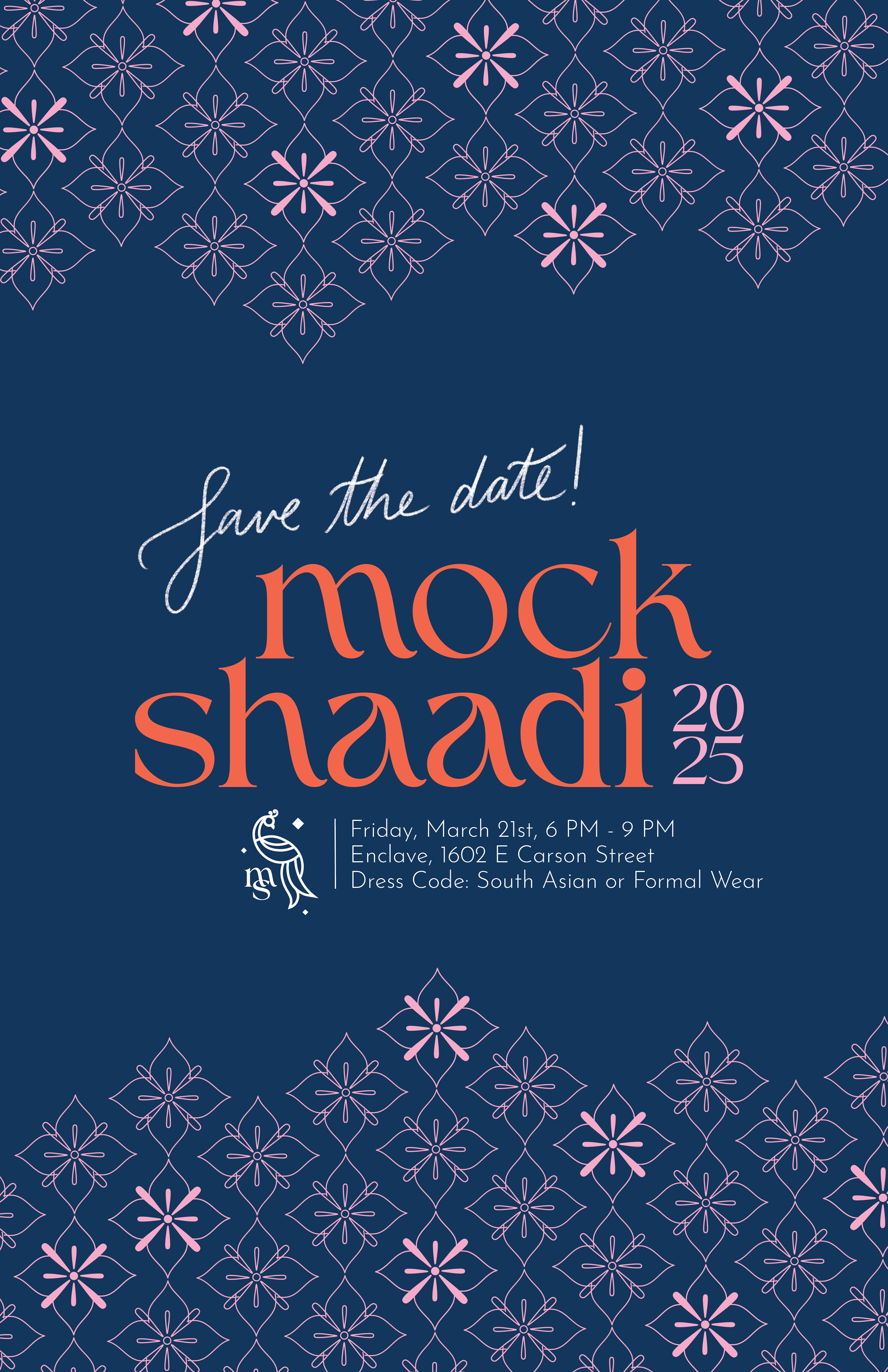
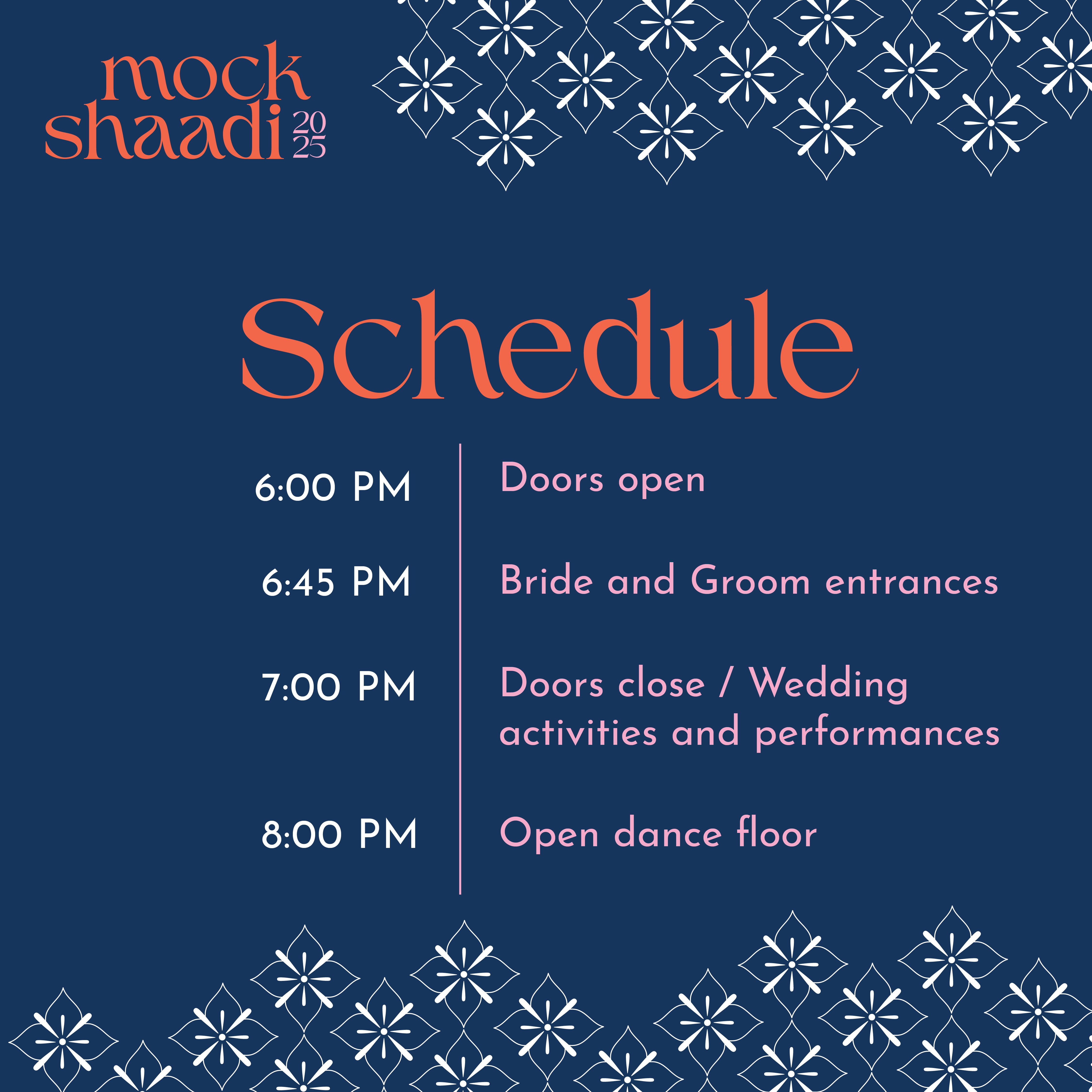
Event Branding - Mock Shaadi
South Asia is known for its extravagant weddings, or as we call it in Hindi: Shaadi. Mock Shaadi is essentially a fake wedding between two students that gives us an excuse to come together and celebrate at the end of the spring semester in our own way!
For the design system, I added a pastel pink and orange to the palette to bring in a sense of warmth and vibrance. I developed a pattern inspired by South Asian architecture and embroidery which I incorporated into all the marketing material. I wanted the promotion to resemble wedding invitations, so I incorporated hand-written text and utilized the format of a save-the-date card.
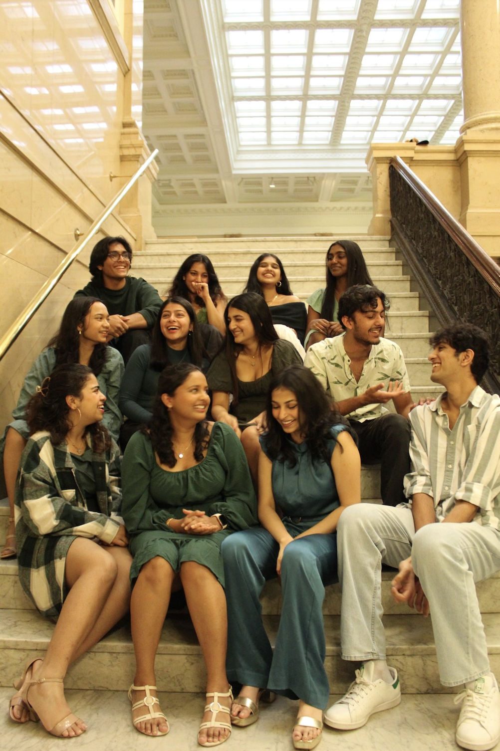
Best memories, Best team
I joined Mayur because I wanted to contribute to the South Asian community at CMU and it was one of the best decisions I ever made. Not only did I get to utilize my design skills to represent our culture, I got to be a part of bringing the community together along with a wonderful leadership team and meet some of my closest friends who will one day be dancing at my *real* shaadi.
Designing for Mayur taught me how to add culture into design in a way that feels familiar in a comforting way while still being new, innovative and exciting. I had the creative freedom to direct the visual identity for each event and put a little bit of myself into every design, which allowed me to explore my ideas and creativity!
I want to thank my lovely leadership team for entrusting me to design and create for this organization, always going along with my creative vision, and encouraging me when I'm constantly overthinking every pixel on a new design. Mayur wouldn't be what it is without you and it will forever be a core memory in my college experience.
Thank you for visiting ❤